OVERVIEW.
The Challenge
Howie Jacobson helps senior leaders stay composed under sustained pressure - to respond rather than react, and to perform at a high level without burnout or fear-based management. It is deep work, drawing on neuroscience and psychology, but its promise is intensely practical: clarity, steadiness and sound judgement when the stakes are highest.
That posed a specific brand problem. Howie's field tends to split into two visual clichés - the cold, corporate language of traditional leadership consulting, or the abstract, spiritual and motivational register of the resilience and mindfulness world. Neither fits a practice built on calm, evidence-based authority. So the identity had to do something harder than look good: it had to embody the very quality Howie teaches. It needed to feel unruffled - composed, grounded and trustworthy at a glance - to an audience of intelligent, highly responsible people who are looking for relief and clarity, not hype. In short, the brand had to be what the work is about.
The Approach
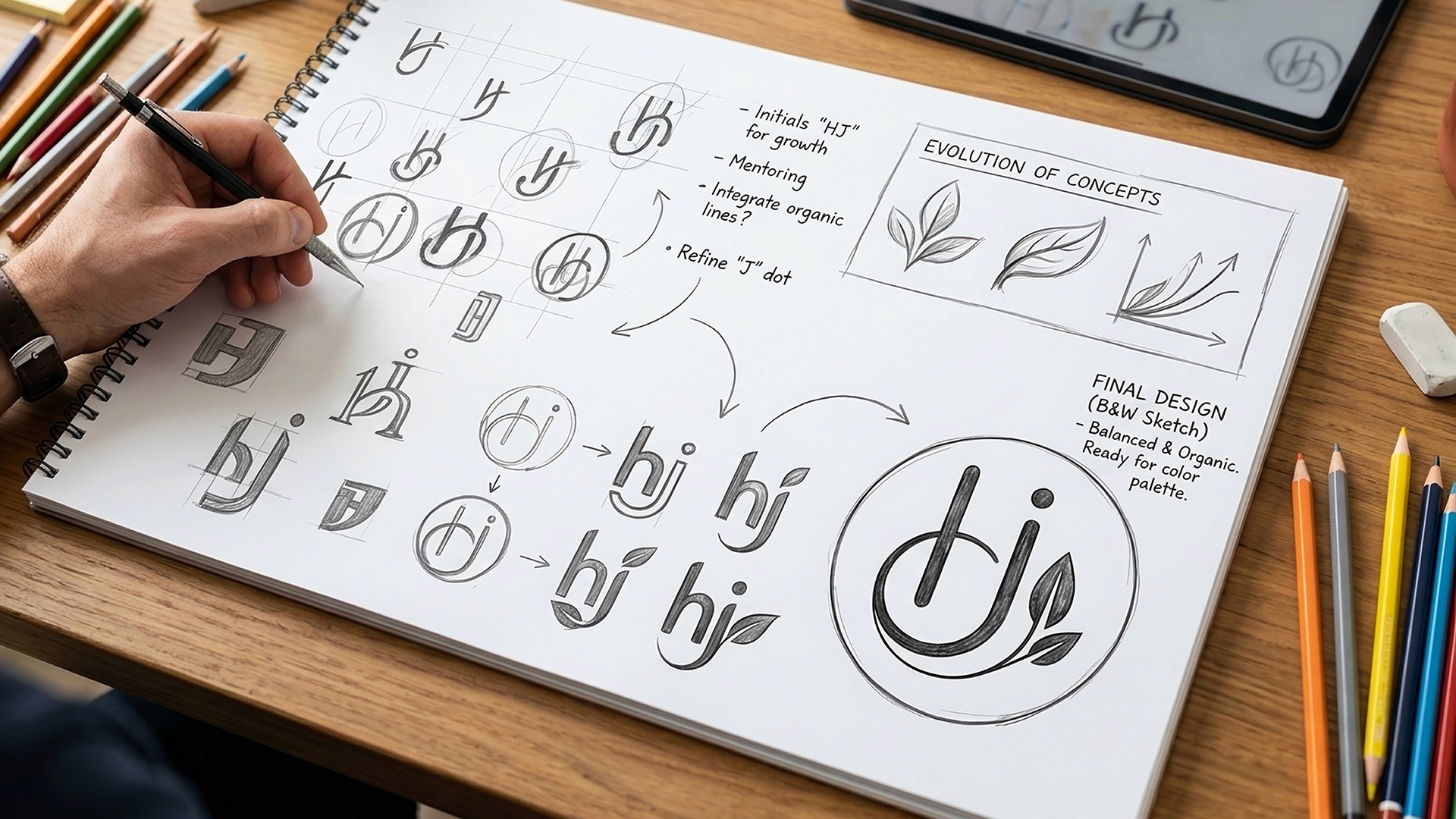
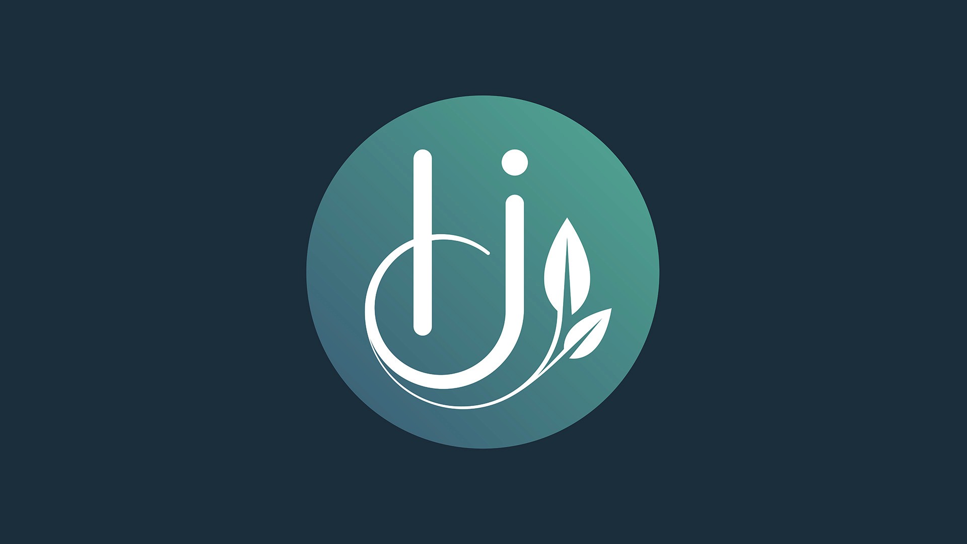
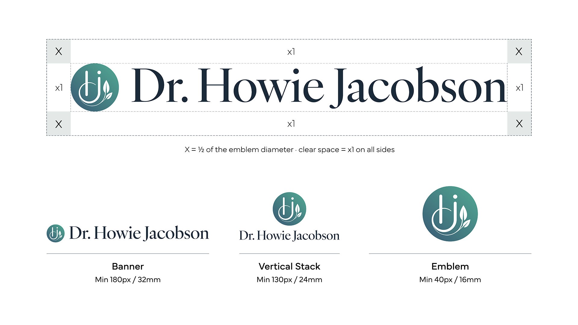
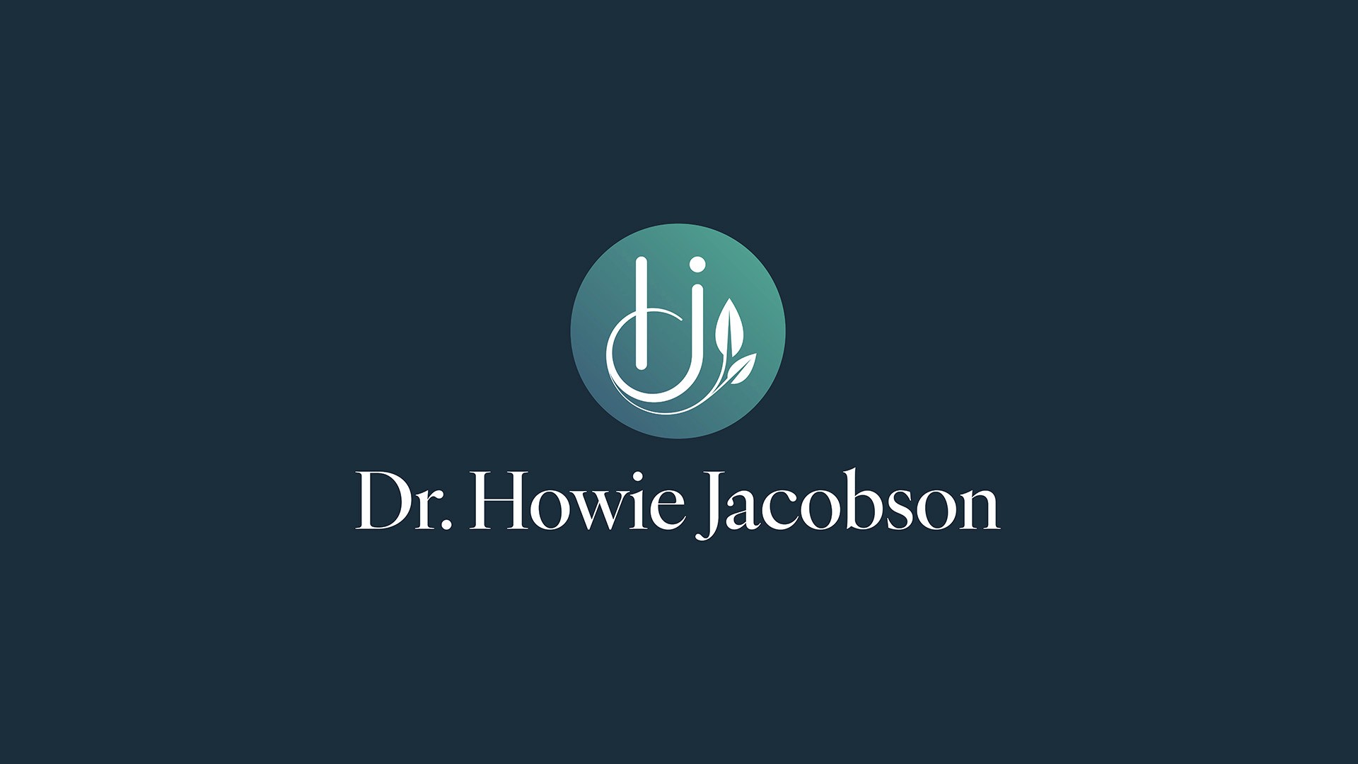
The mark began with the initials and grew from there - literally. Early exploration combined the h and j with organic, growing lines before settling on a single idea: steady growth. The final monogram sets the two letters inside a contained circle, with a leaf unfurling from the foot of the j. The circle does the heavy lifting - it reads as something whole, grounded and self-contained, calm rather than busy - while the leaf brings the living, human quality of Howie's work and signals growth and change. The upright stems of the letter forms hold the whole thing steady.

For all its organic feel, the mark is built on a precise geometric framework - the discipline beneath the calm. That rigour is the point: it is the visual equivalent of the grounded, evidence-based wisdom Howie brings to his clients. Depth without mysticism.
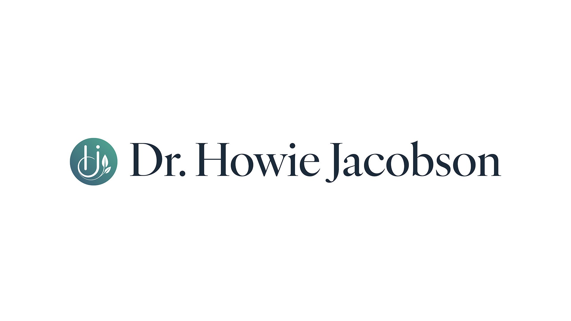
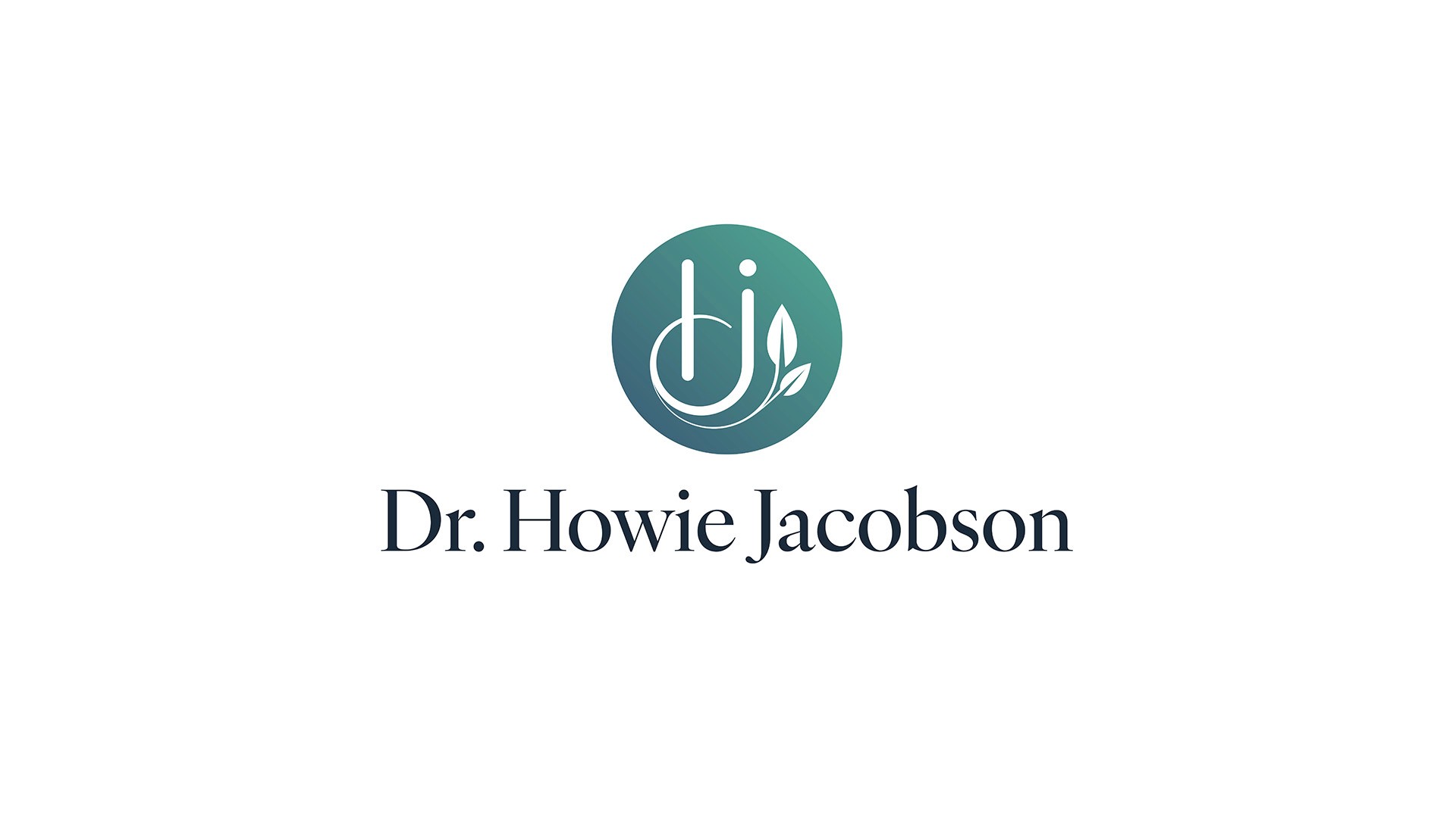
The identity ships as a working system rather than a single logo: a primary banner lockup, a vertical stack and a standalone emblem, each supplied in positive and reversed treatments. Clear space is set to half the emblem diameter and minimum sizes are defined for every version, so the brand stays crisp everywhere from a website header to a favicon.
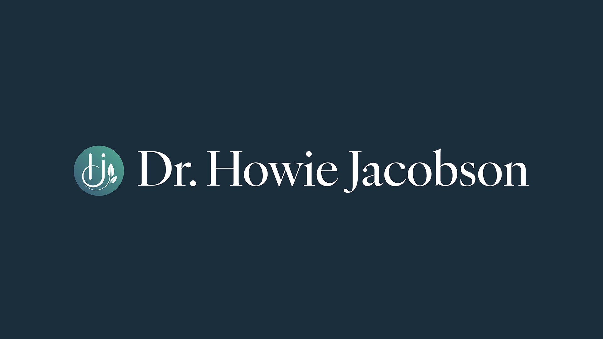
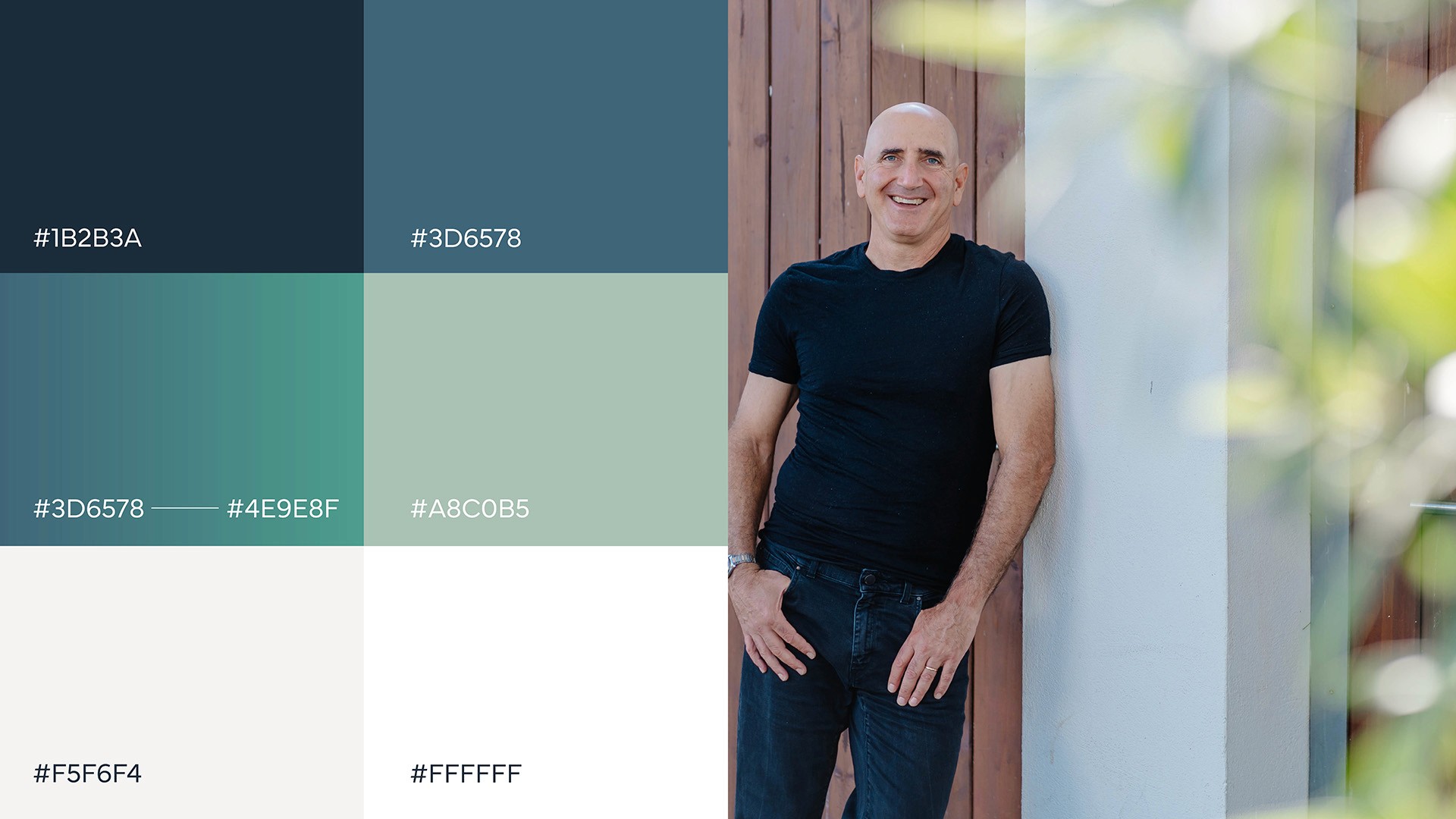
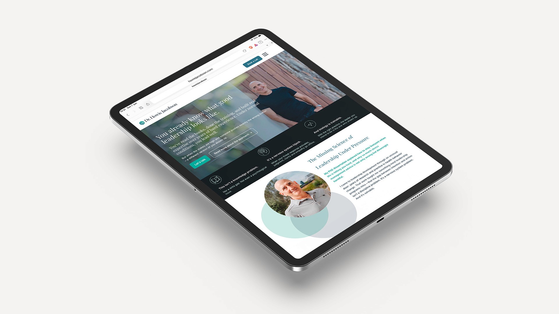
The palette is calm by design. A deep ink-navy anchors everything with grounded, unflappable authority; a steel blue and a teal-to-green emblem gradient bring clarity and a quiet, living energy; a soft sage adds warmth and humanity; and a generous off-white keeps the system breathing. It is deliberately deep rather than corporate-cold, and calm rather than loud - and the space around the elements carries as much of the message as the colours themselves.
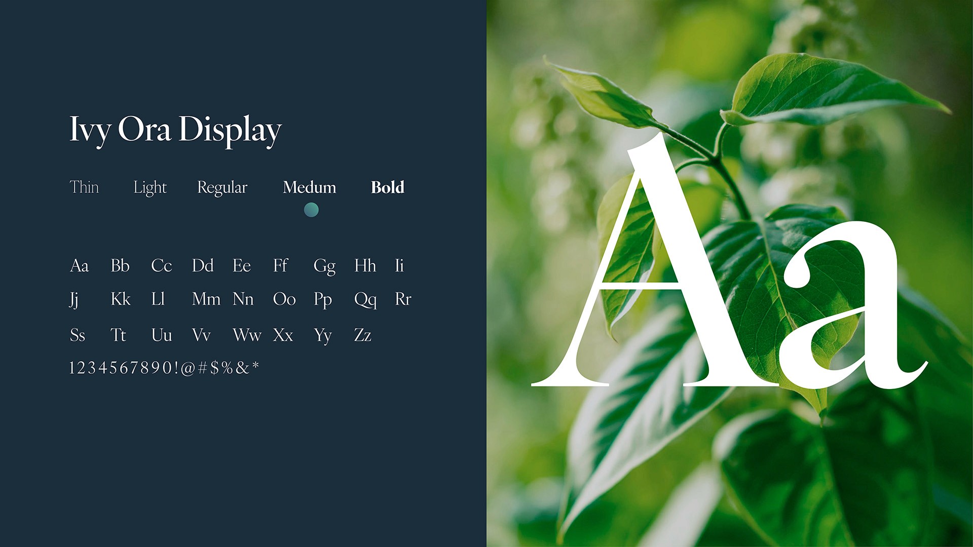
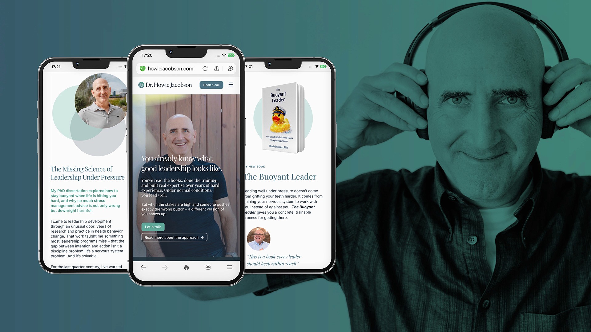
IvyOra Display, a high-contrast editorial serif, carries the wordmark and headlines - elegant, considered and quietly authoritative, the right register for a reflective, intelligent audience and for a body of work that includes a book. It is paired with Work Sans for everything functional, keeping the language grounded, readable and free of jargon. Serif for depth; sans for clarity.
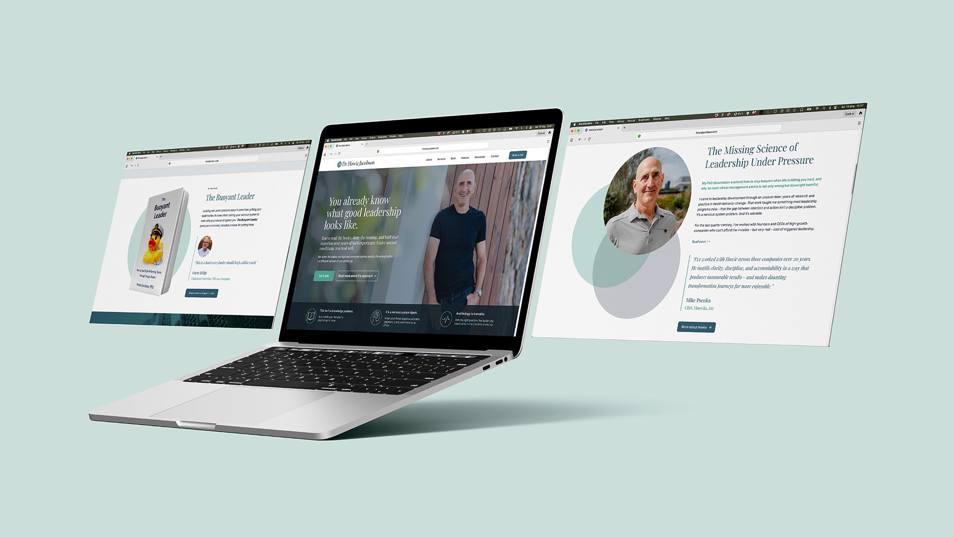
The system comes together in a fully responsive website across desktop, tablet and mobile. It opens on Howie's disarming central line - "You already know what good leadership looks like" - set in calm serif over a warm portrait, with plenty of room to breathe before resolving into the nervous-system thesis and a clear path to the book and a conversation. The restraint is intentional: the layout feels unhurried and in control, an embodiment of the composure the work is built on.
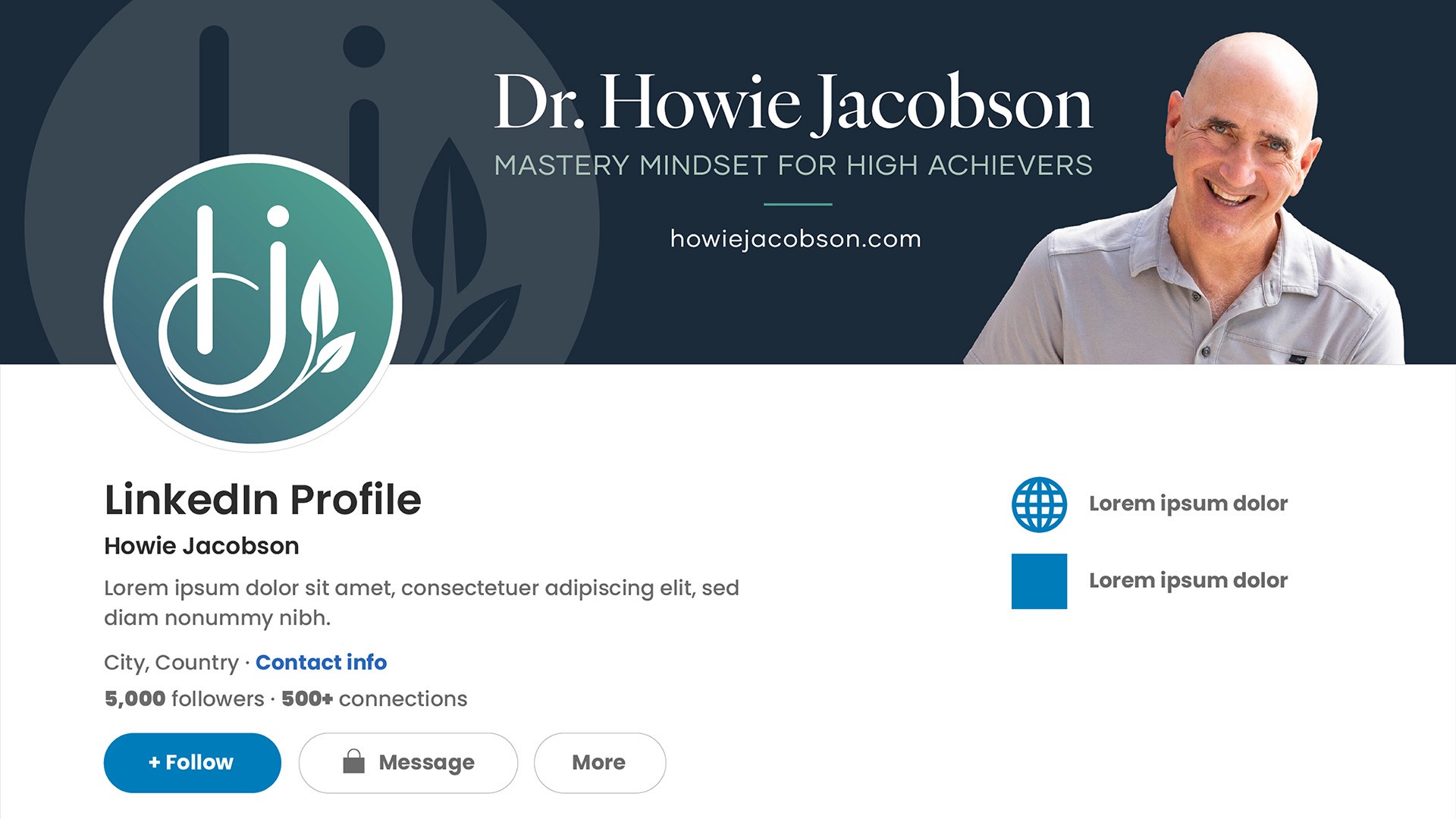
Finally, the identity extends into the channels where Howie's audience actually spends its time - a LinkedIn banner and profile treatment carrying the monogram, portrait and positioning line, "Mastery Mindset for High Achievers" - alongside a reusable newsletter template, so the brand stays consistent from first impression through to the ongoing relationship.
The Outcome
The result is an identity that reads, instantly, as calm, credible and grounded - the visual embodiment of composure-based leadership, and a clear step away from both the cold-corporate and the abstract-spiritual ends of Howie's field. He now has a flexible logo system, a documented colour and type foundation, and an elegant responsive website ready to carry his thought leadership, his book and the next phase of the practice - built, fittingly, to stay unruffled under pressure.
Client Feedback
"I've worked with many designers over the years, and - not to brag - they've all said the same thing about me: I show up with vibes instead of a brief, and the vibes keep shifting. Huw handled the whole mess with calm and professionalism. He asked as many good questions as it took to really understand my vision, absorbed a lot of false starts, and built me a site I'm genuinely proud of. He's as skilled as he is patient."
Dr. Howie Jacobson