OVERVIEW.
The Challenge
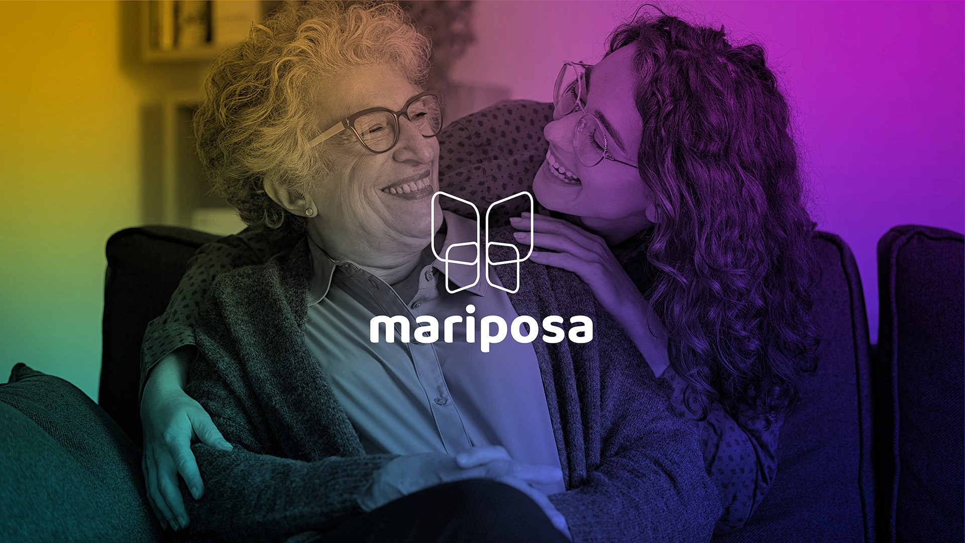
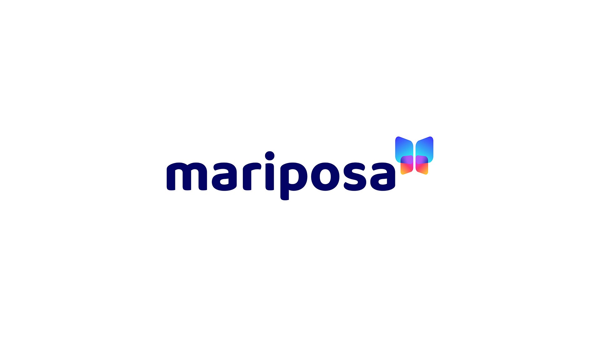
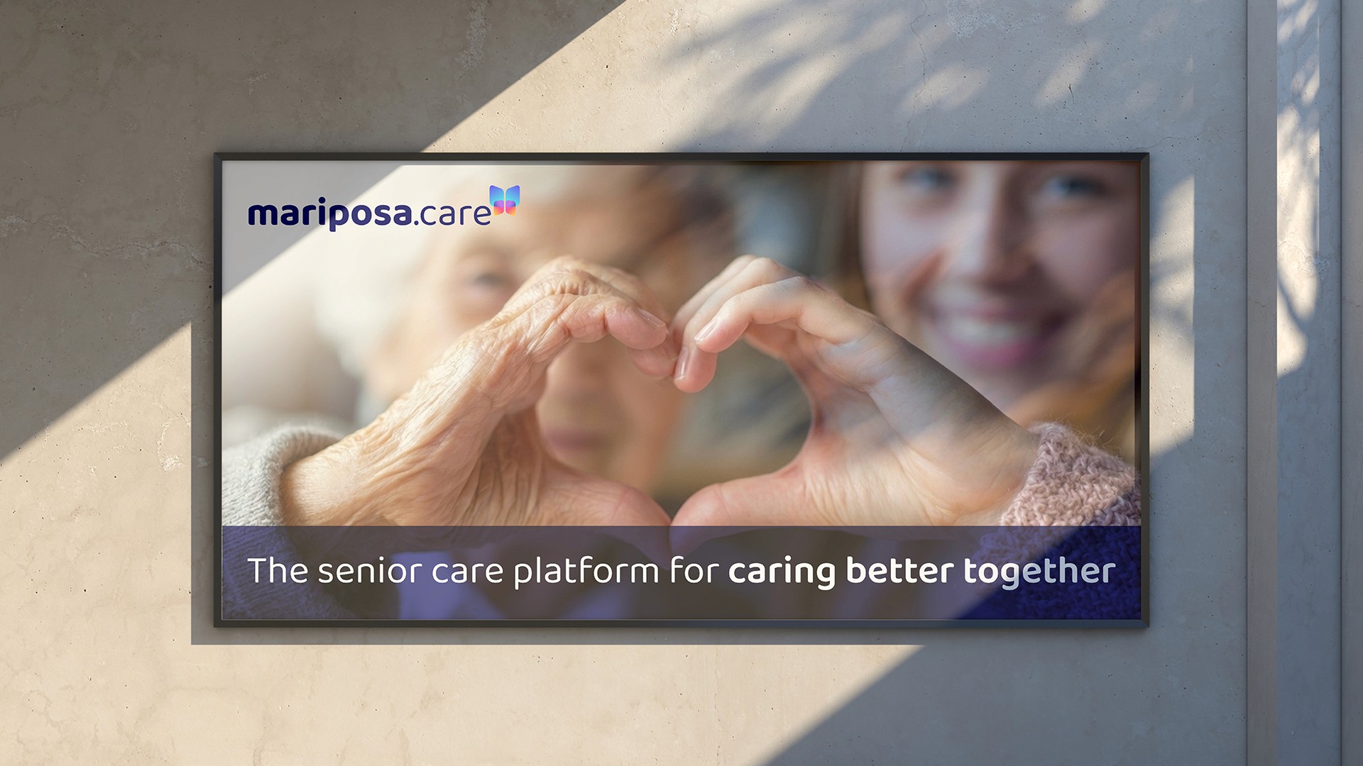
Mariposa is an in-home senior care platform designed to help family members and professional caregivers manage personalised care plans for elderly relatives. Preparing to launch their app and website, the business needed a visual identity that could carry the brand across digital and print from day one - bright, friendly and vibrant, yet confident and credible enough to stand alongside established players in the health technology space.
The Approach
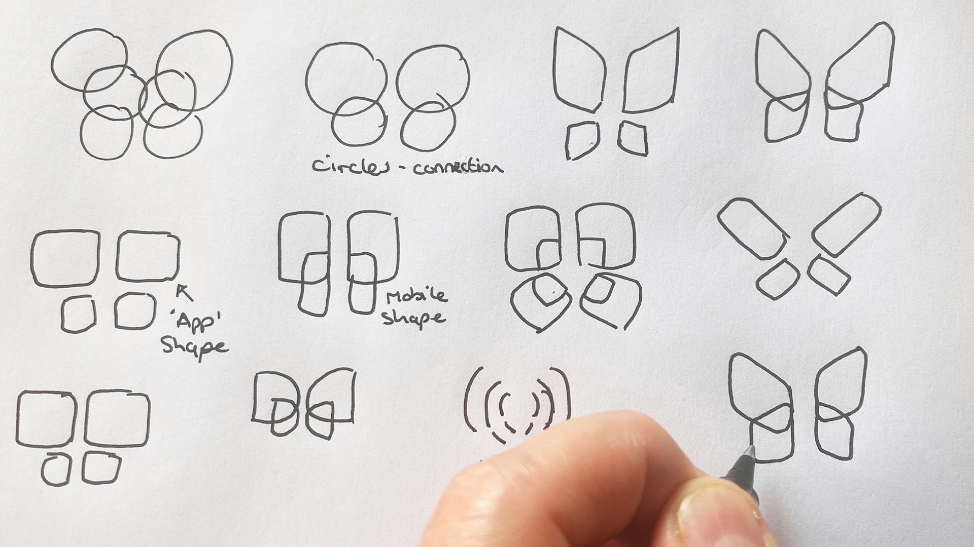
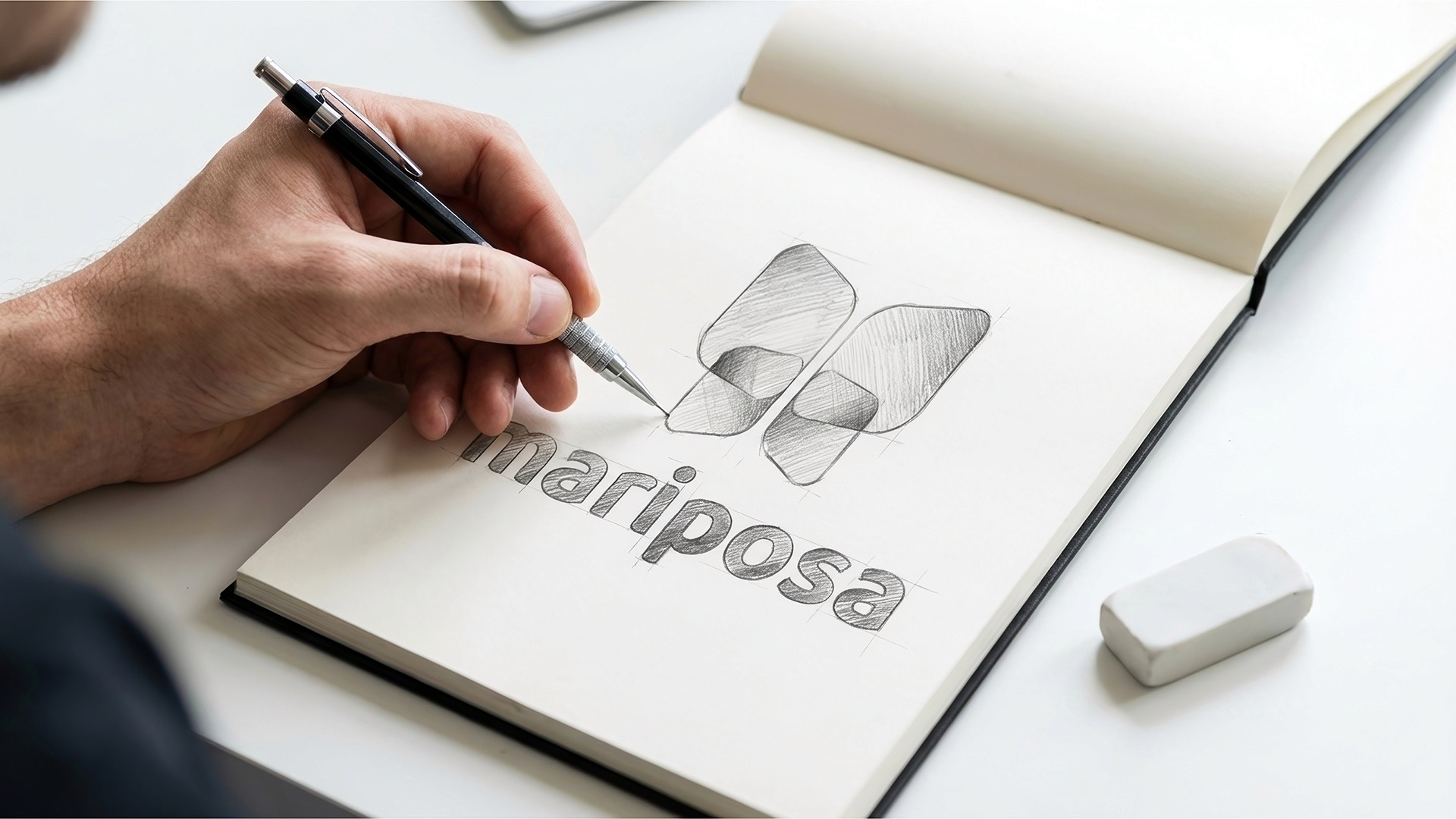
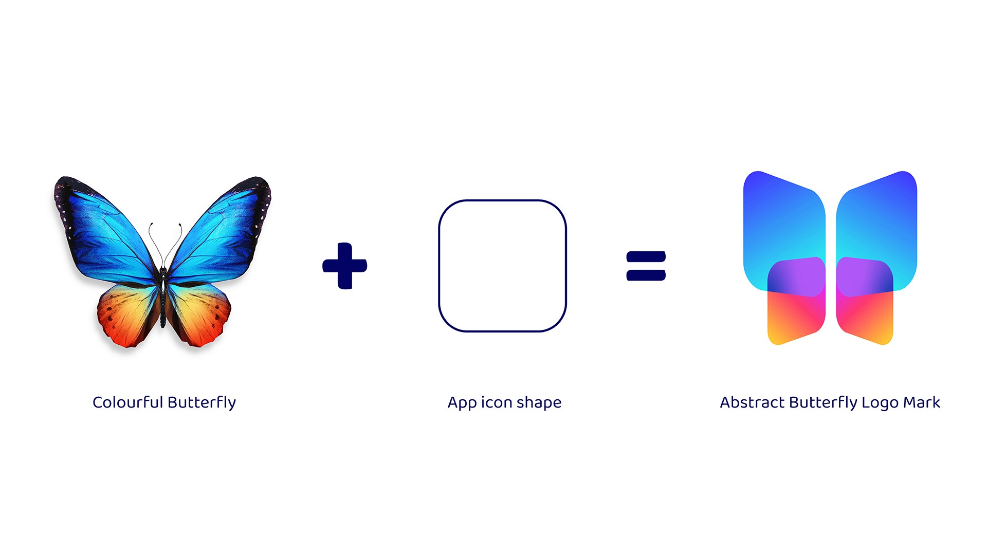
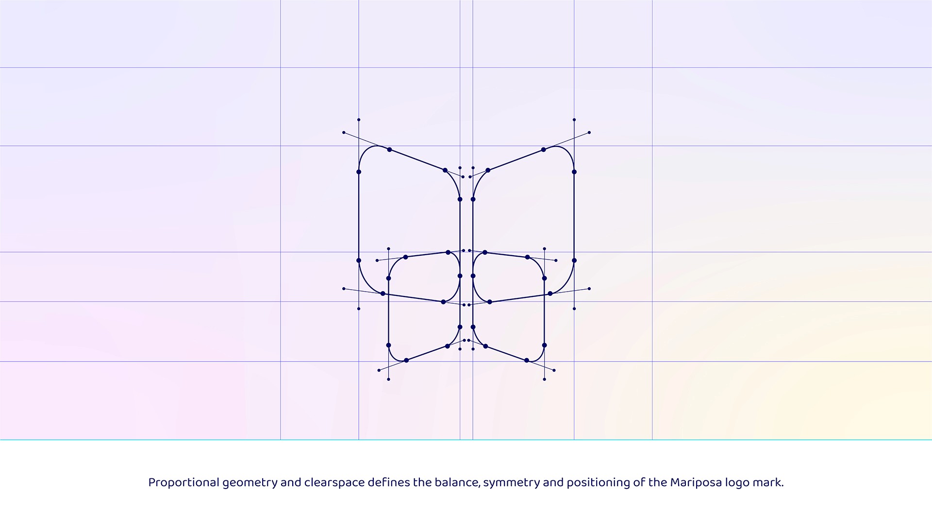
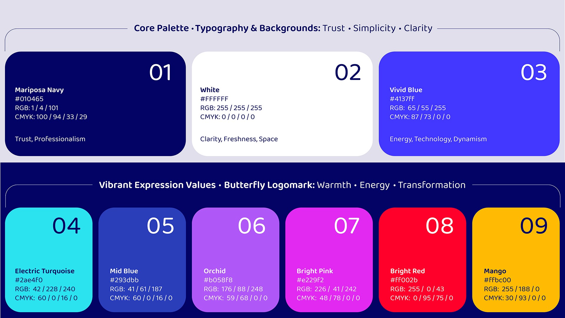
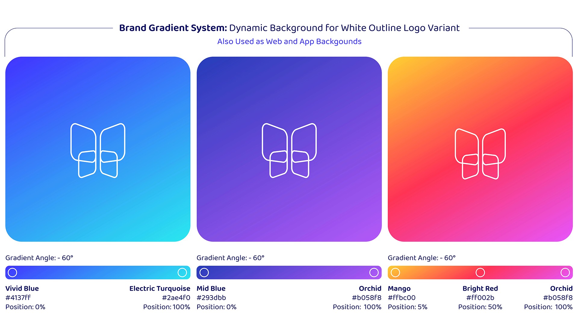
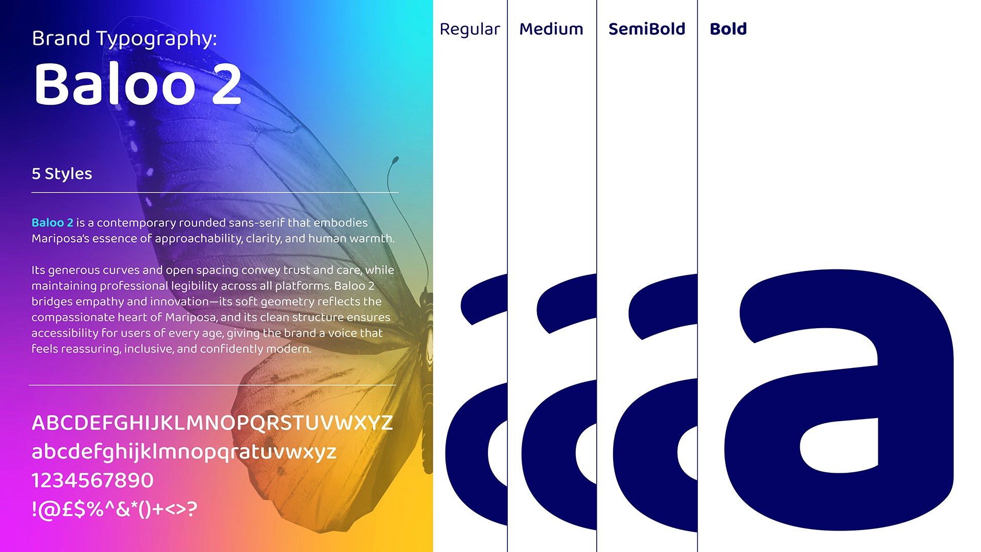
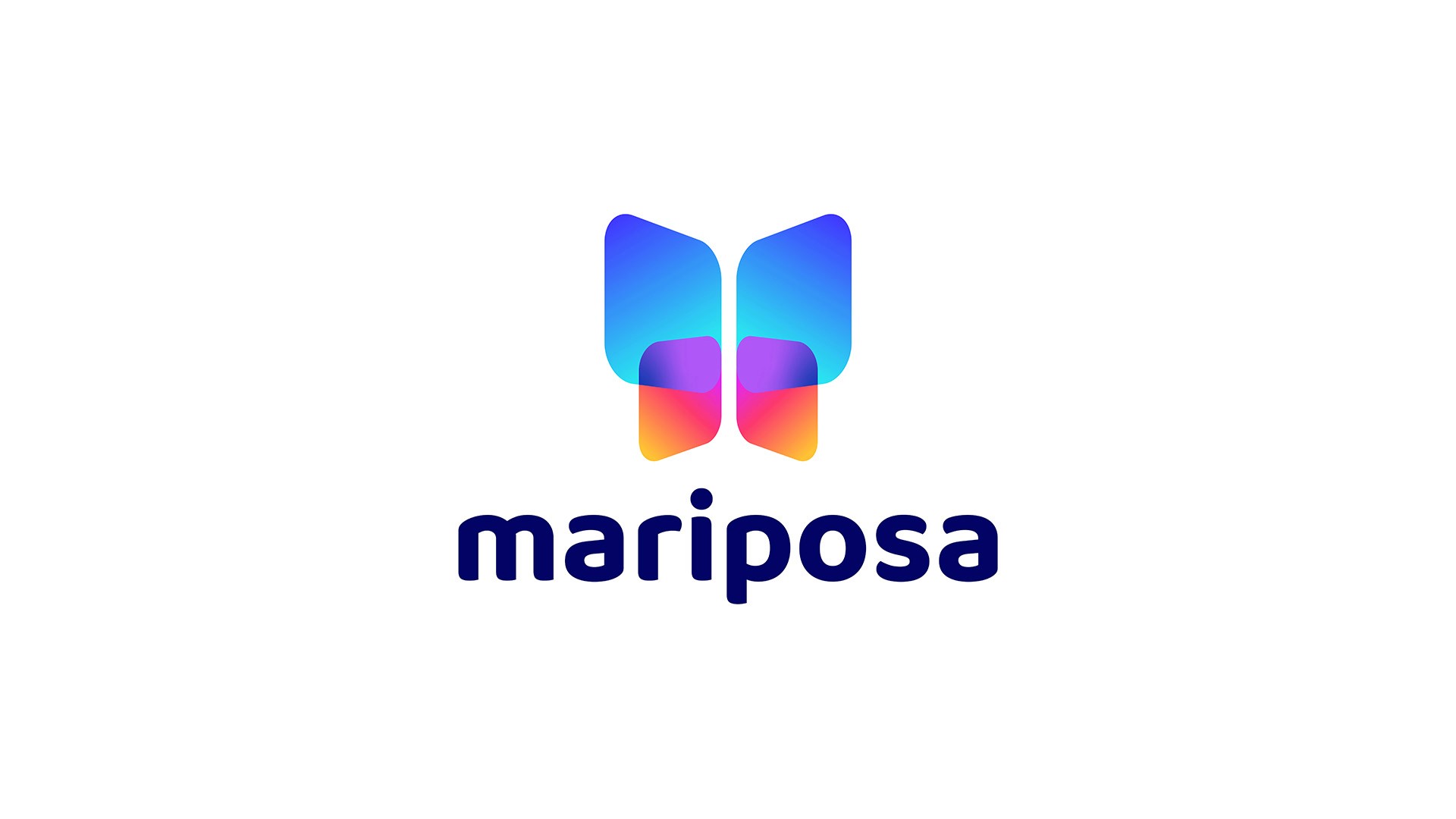
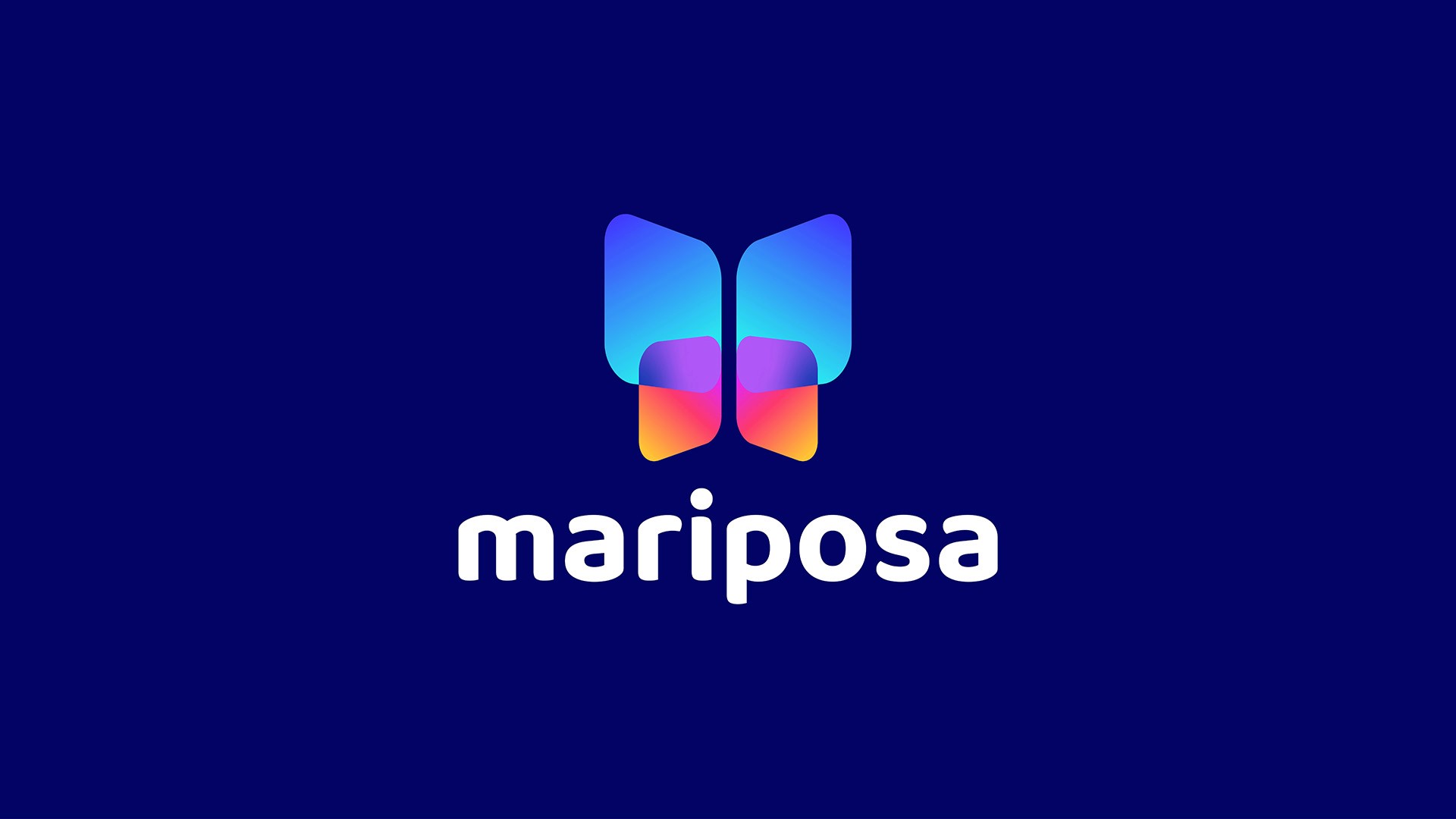
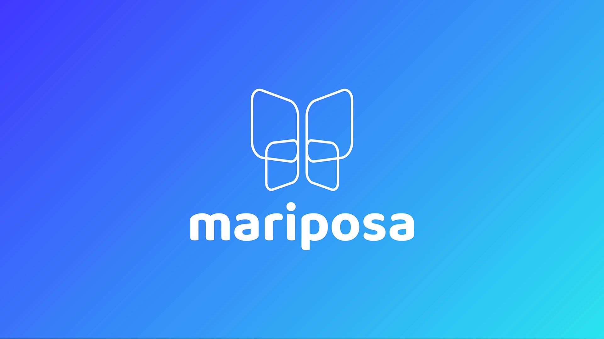
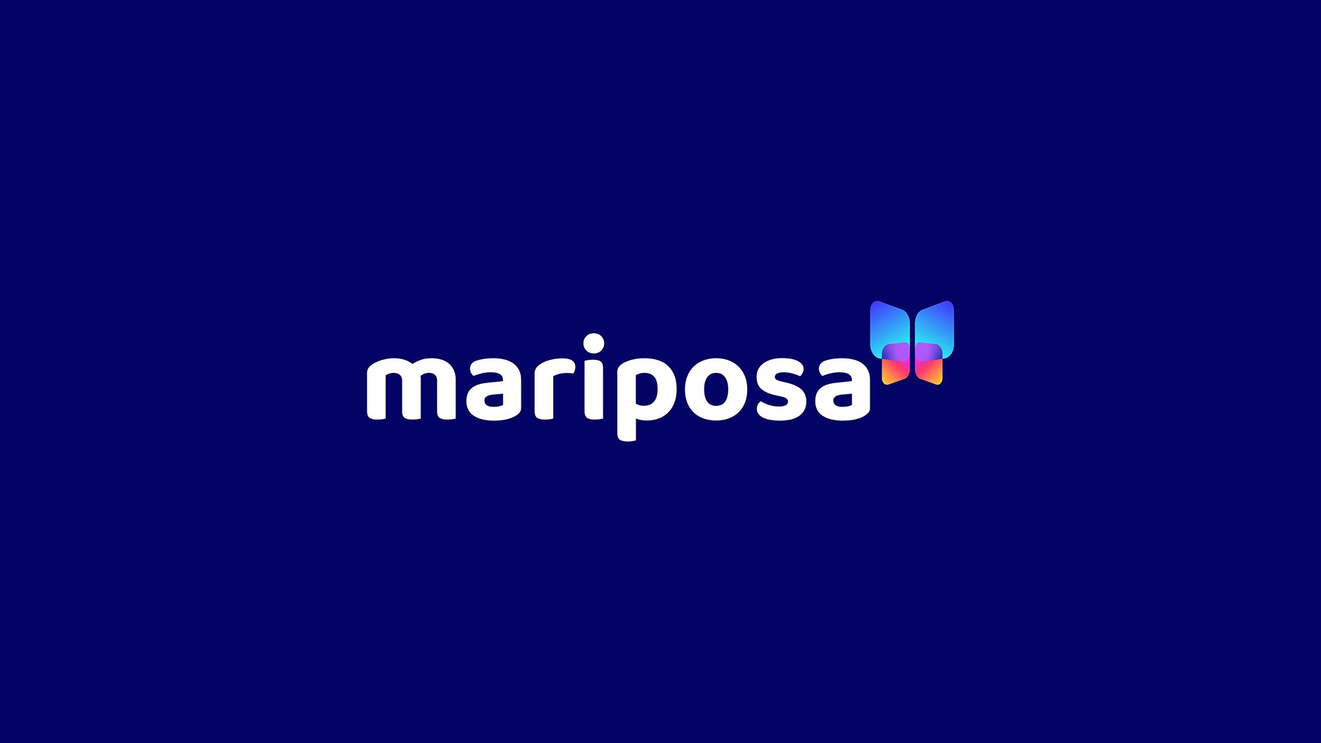
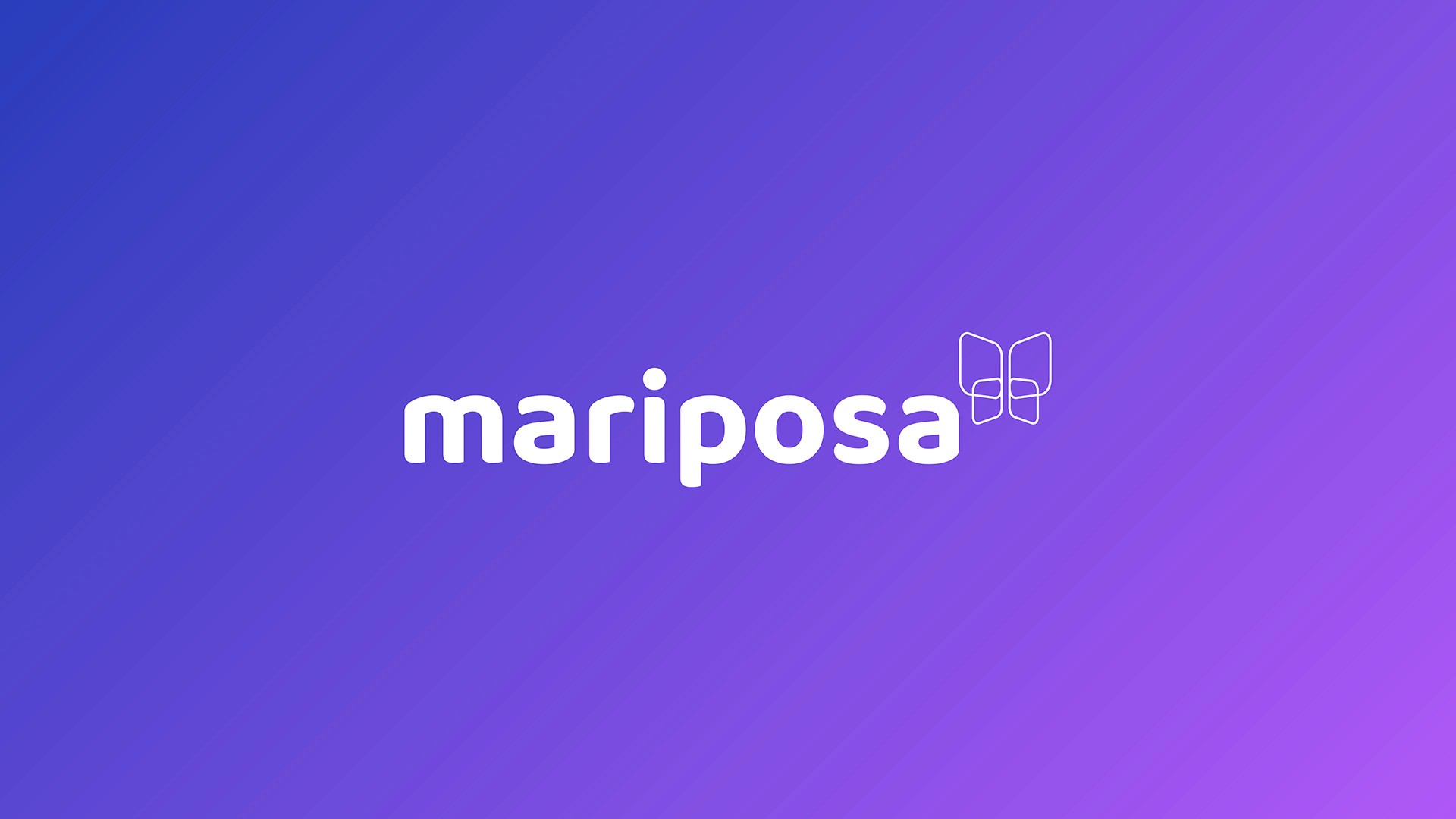
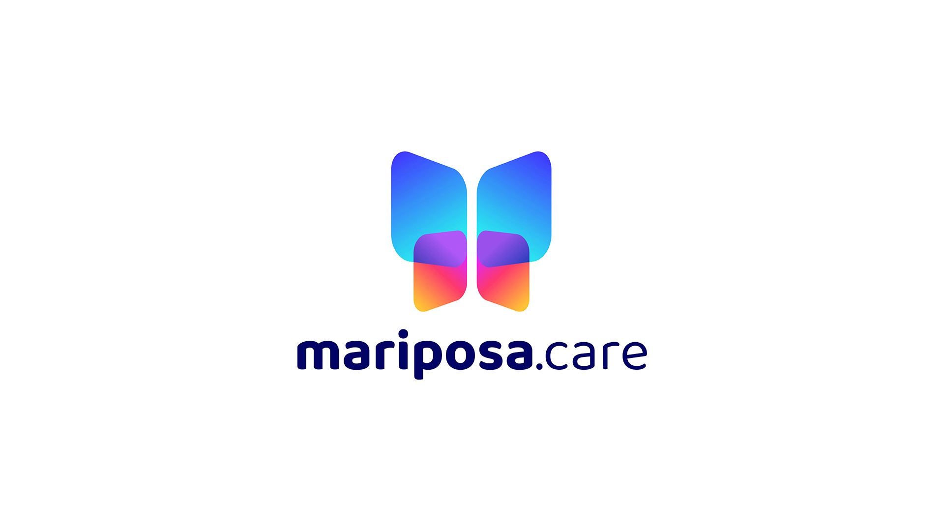
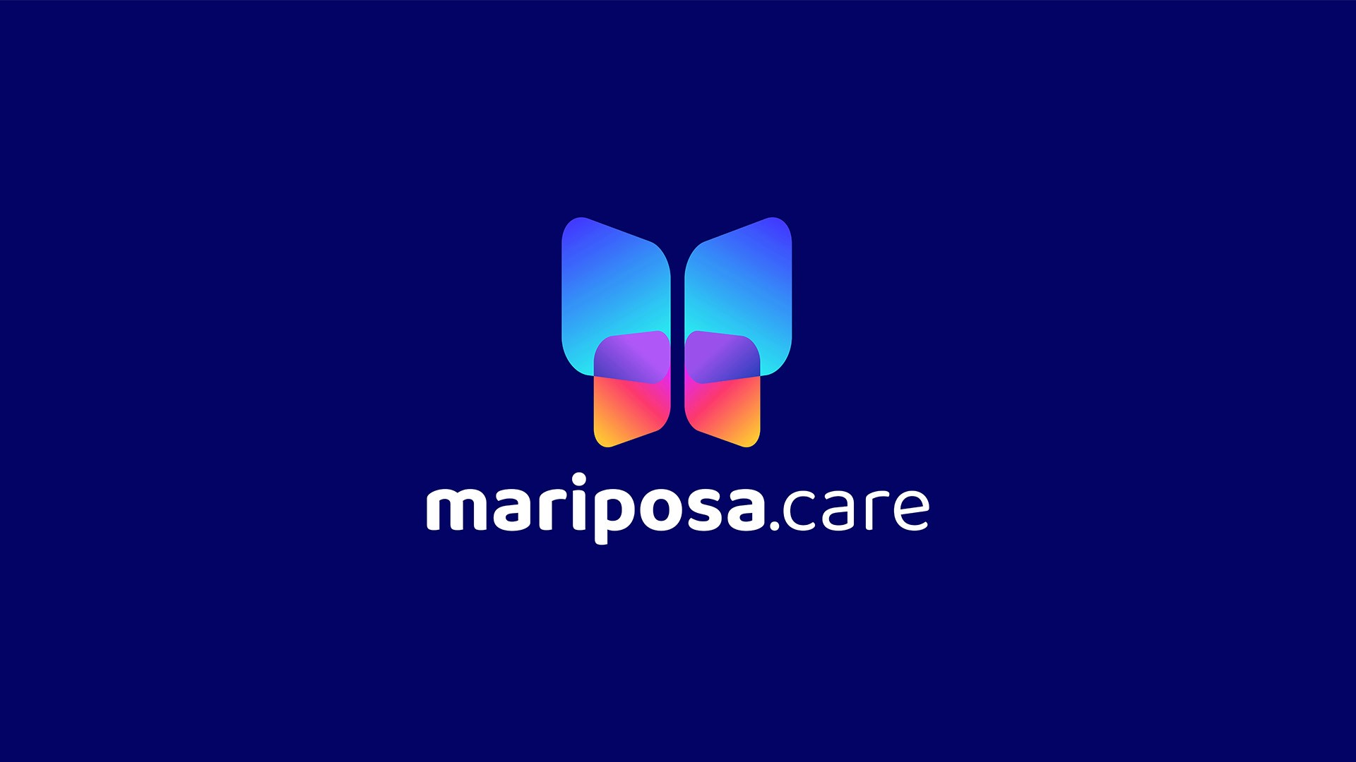
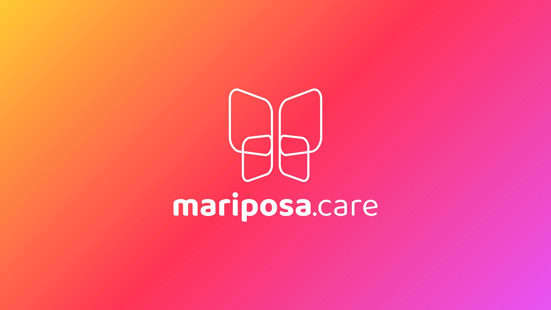
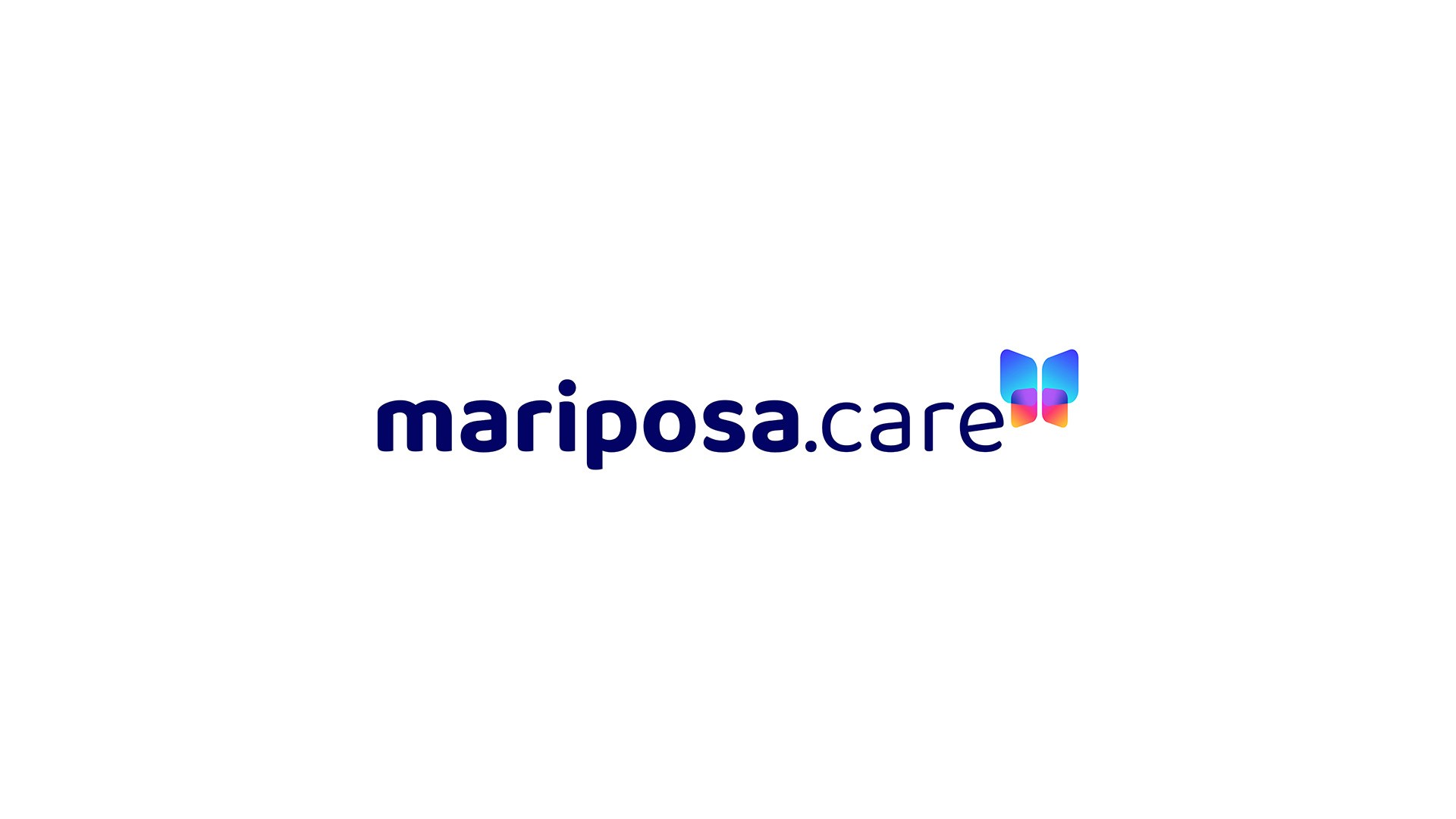
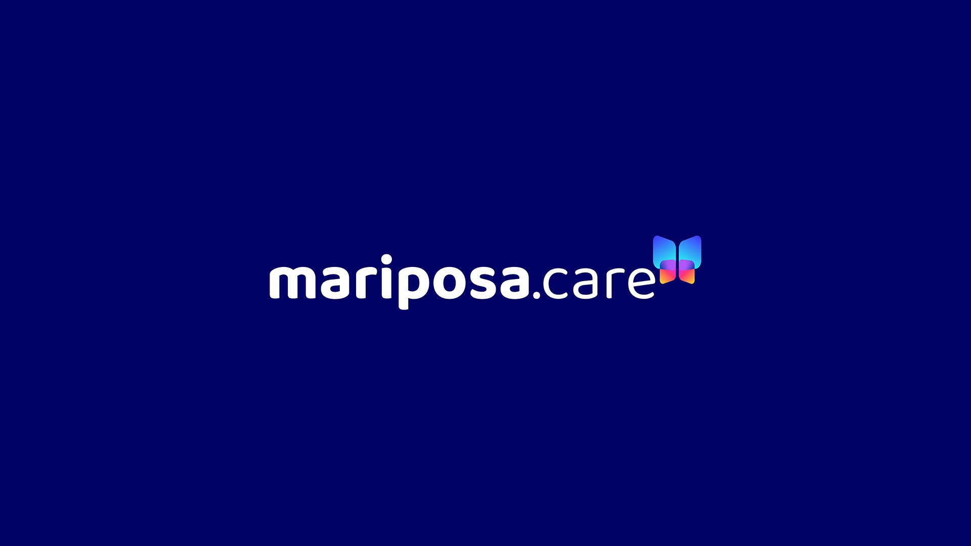
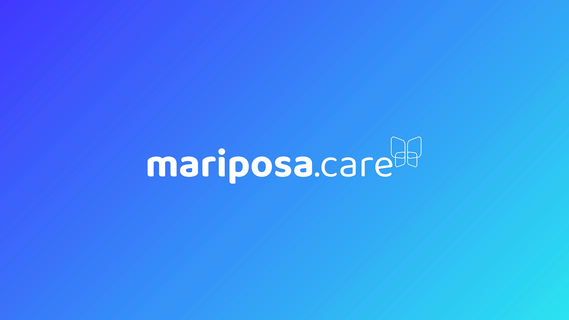
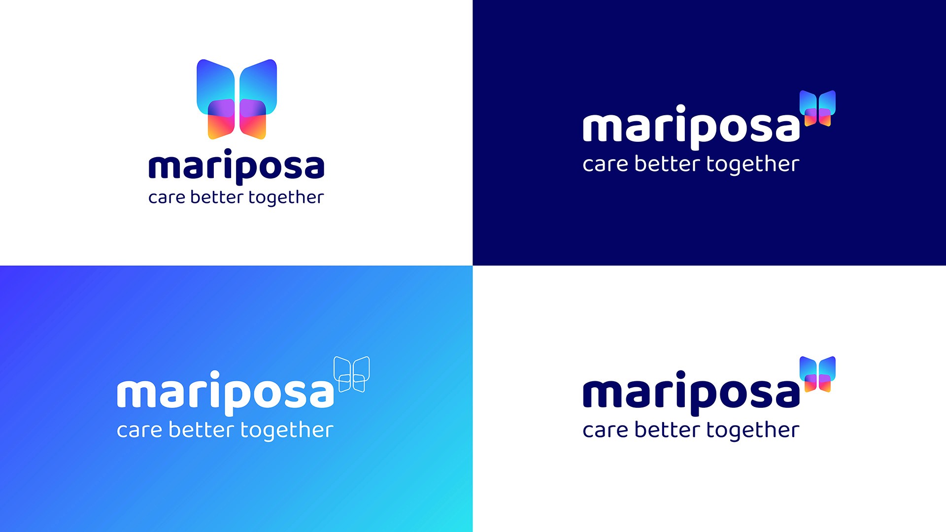
The Mariposa visual identity was developed to balance emotional warmth with digital clarity. The name - meaning butterfly in Spanish - informed a visual direction that felt optimistic, personal and alive without being childlike or patronising. The colour palette was built around warm, uplifting tones that could flex across the full range of digital and print applications, with typography chosen to be highly legible at small sizes while retaining personality at display scale.
The Outcome
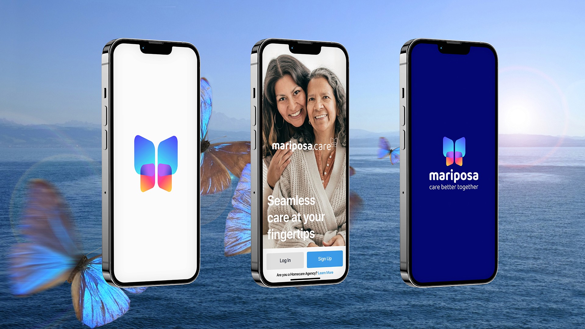
The Mariposa identity launched alongside the app and website, deployed across all digital and print touchpoints. The identity gave the platform a distinctive, ownable presence in a crowded sector - one that felt genuinely different to the clinical aesthetic common in health technology.

Client Feedback
"Huw delivered excellent work on this project. The visual identity he delivered has proven extremely effective and impactful. He was also a pleasure to work with. I would highly recommend Huw to other potential clients for similar work."
Jim Lightsey - Founder and CEO, Mariposa