OVERVIEW.
The Challenge
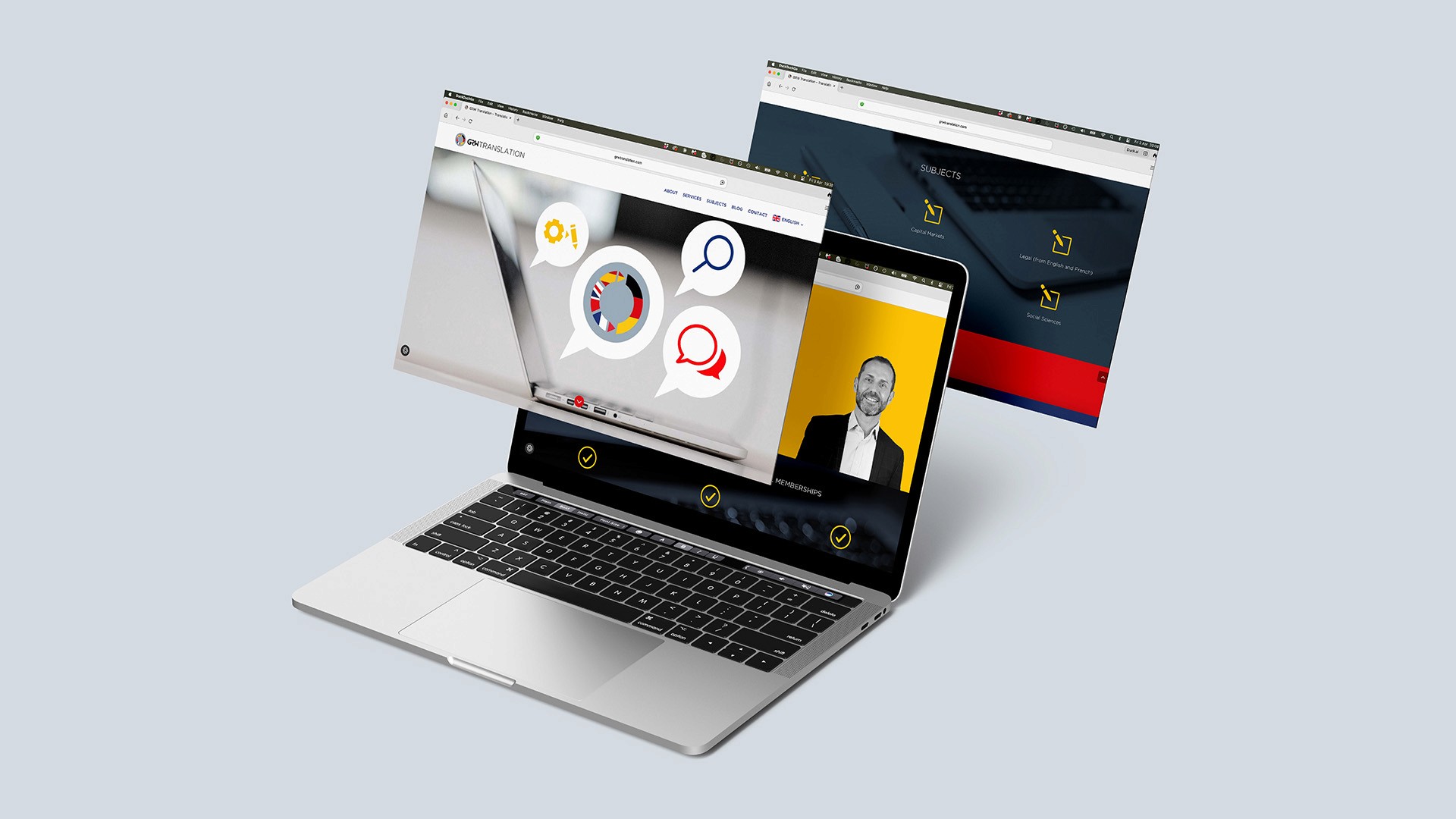
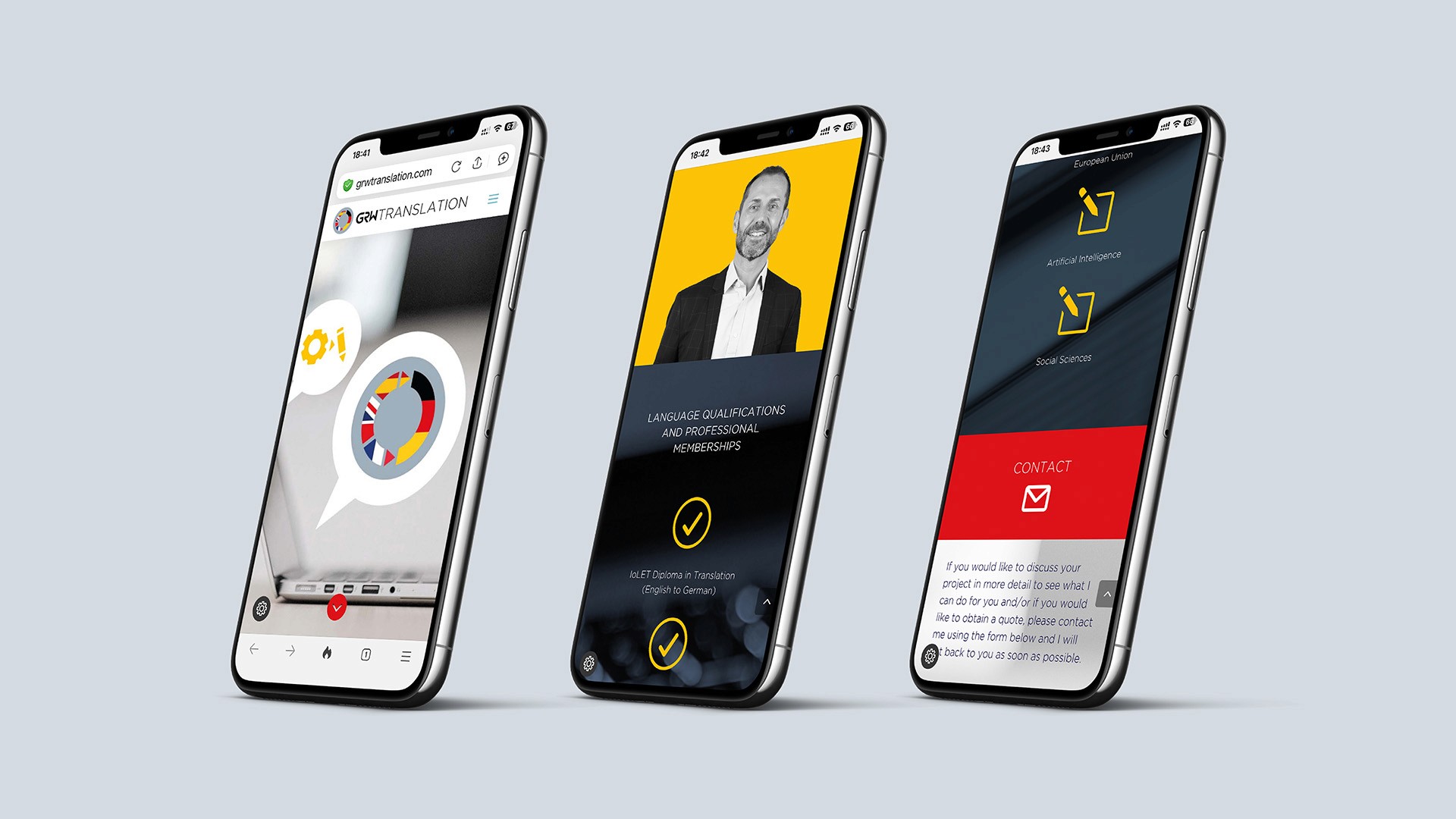
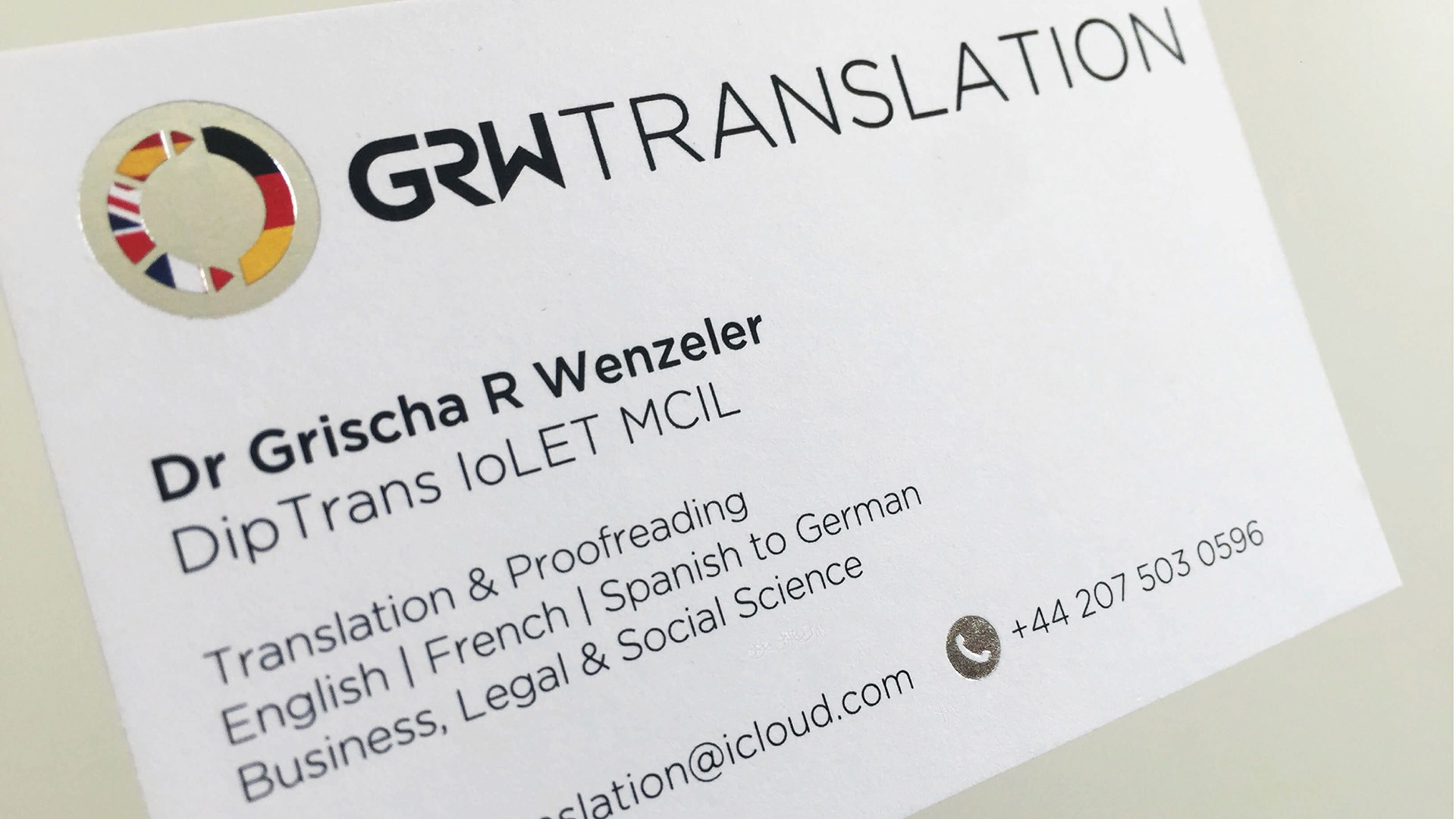
GRW Translation is a specialist freelance translation and linguistics business owned by Dr. Grischa Wenzeler, a certified professional translator offering English, French and Spanish to German translation services for business, legal and academic clients across Europe.
At the start of the engagement the business was at the startup stage - Grischa had the expertise and the client relationships but no visual identity to represent him professionally to agencies and private clients. The brief was clear: create a distinctive, confident and memorable brand identity that would make an immediate impact in a crowded freelance translation market and communicate the breadth of the language specialisms at a glance.
The Approach
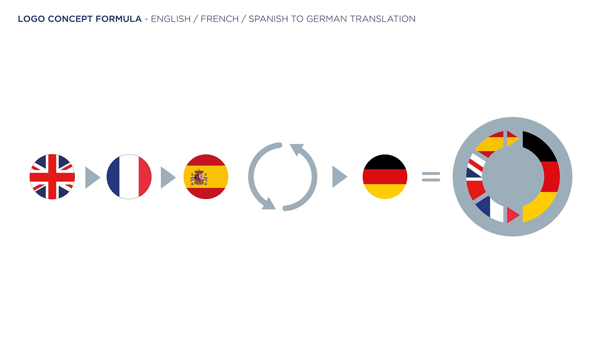
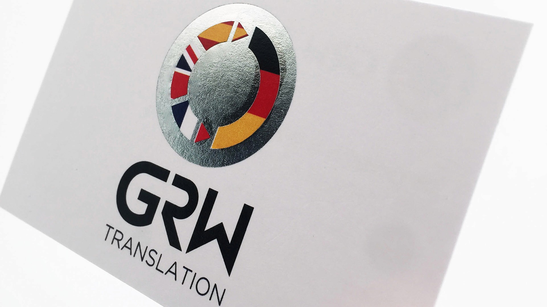
The central creative challenge was finding a visual device that could communicate multilingual specialism instantly -without resorting to generic globe iconography or language clichés. The solution was to embed the brand's language identity directly into the logo mark itself.
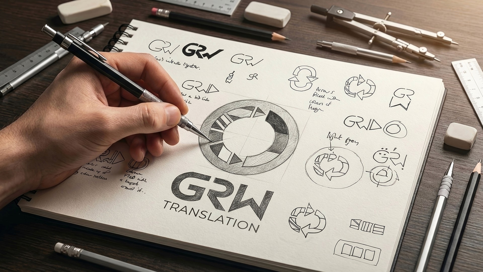
The identity design process began with extensive concept sketching - exploring how the language pairs could be represented visually before committing to a digital direction. The circular form emerged early as the strongest device for unifying the four national identities into a single, coherent mark.
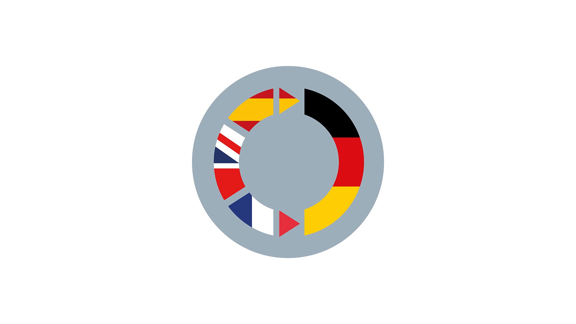
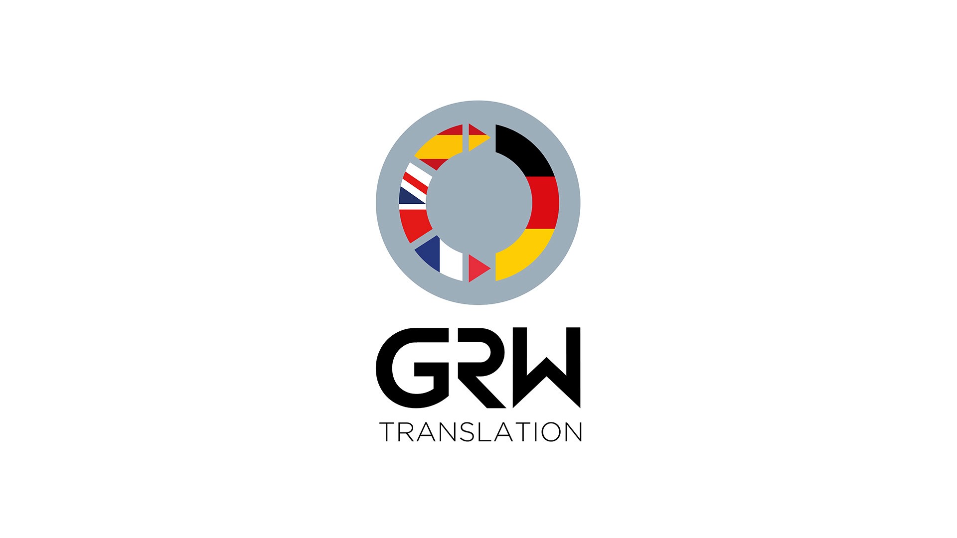
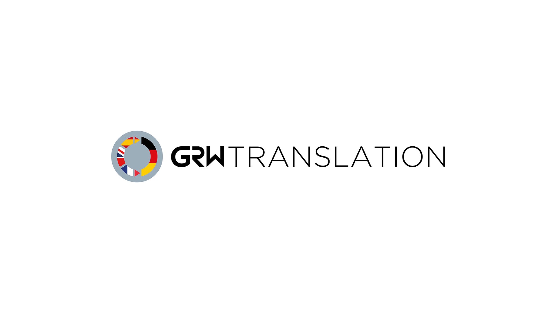
The circular emblem was built around the four national flags representing GRW Translation's core translation protocol - British, French, & Spanish into German - segmented and arranged as a unified ring. Each flag segment is precisely proportioned and colour-accurate, creating a mark that is immediately readable as an international, multilingual brand without a single word of explanation.
The GRW logotype was created as a custom, geometric style word mark - confident, unique, modern and highly legible at both large display scale and small application sizes. The combination of the bold word mark and the colourful circular emblem creates a strong visual contrast that gives the brand energy and distinctiveness.
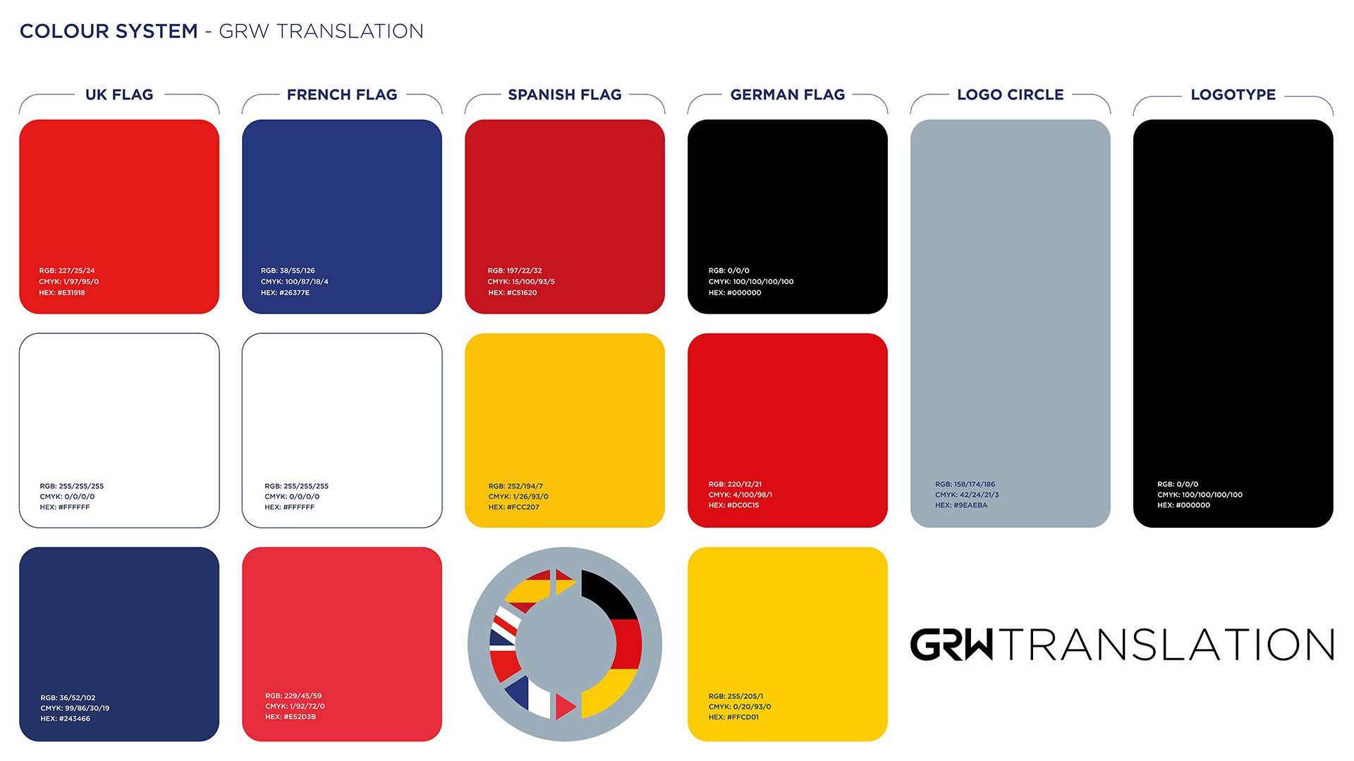
The colour system was developed to document and standardise every colour present in the identity - drawing from the precise flag colour specifications of each nation represented, ensuring consistency across all digital and print applications. Each colour is specified in RGB, CMYK and HEX for comprehensive cross-media use.
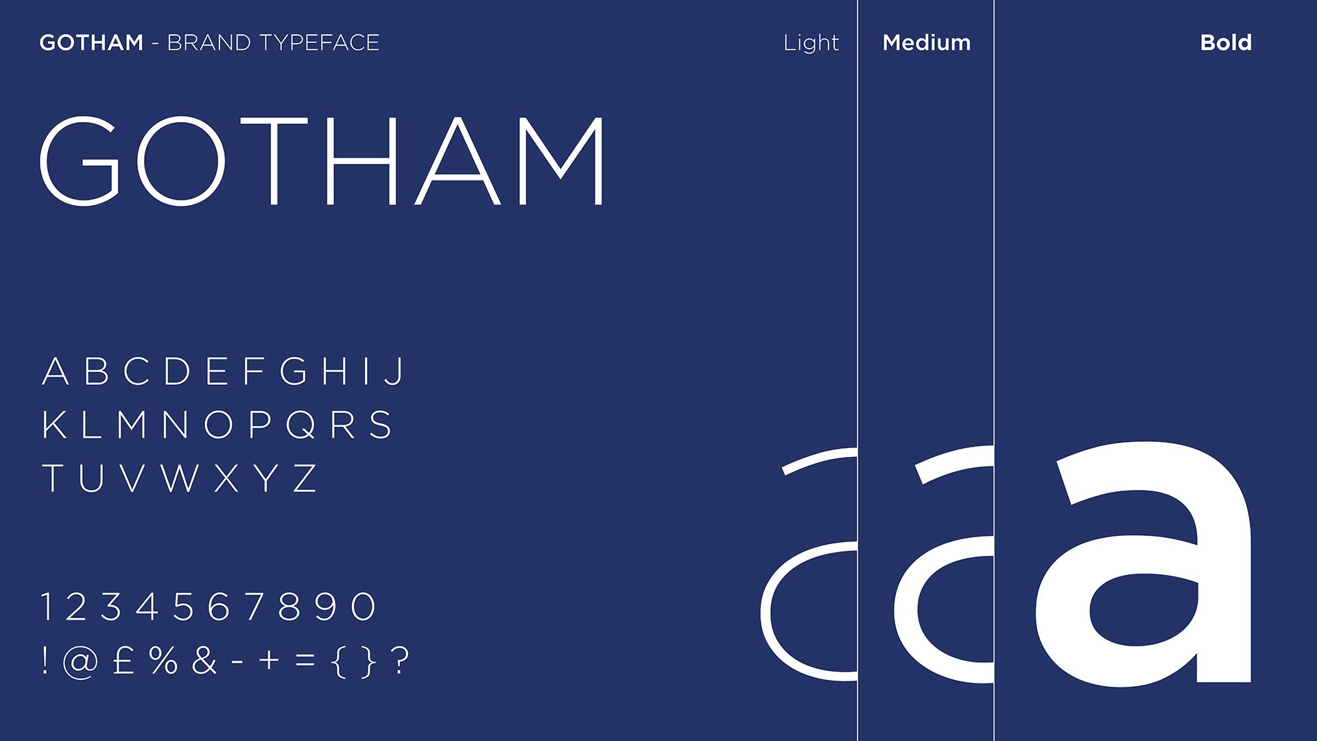
Gotham was selected as the brand typeface - a geometric sans serif with strong heritage in professional and institutional contexts, bringing authority and clarity to all brand communications.
Client feedback:
"Working with Huw has been a pleasant experience as he listened to my requirements and offered various design
options to choose from. He also works with a team of experienced IT experts that ensure my website is always
properly maintained and up to date, so that he is able to offer a comprehensive service during the design phase and
after. I can thoroughly recommend him."
Dr. Grischa Wenzeler - Founder & Owner, GRW Translation