OVERVIEW.
The Challenge
Opal Wild is a boutique luxury jewellery brand serving the premium international retail market. The brief was demanding and specific - the identity needed to feel timeless yet bold, refined yet with a subtle edge. It had to function across packaging, digital touchpoints and future brand extensions, and it needed to let the jewellery itself remain the visual hero rather than competing with it. As the project developed, the client also requested exploration of tagline directions and alternative typography treatments to give the brand additional expressive range.
The Approach
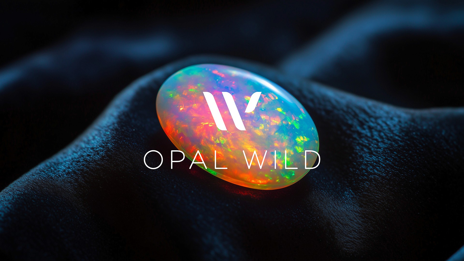
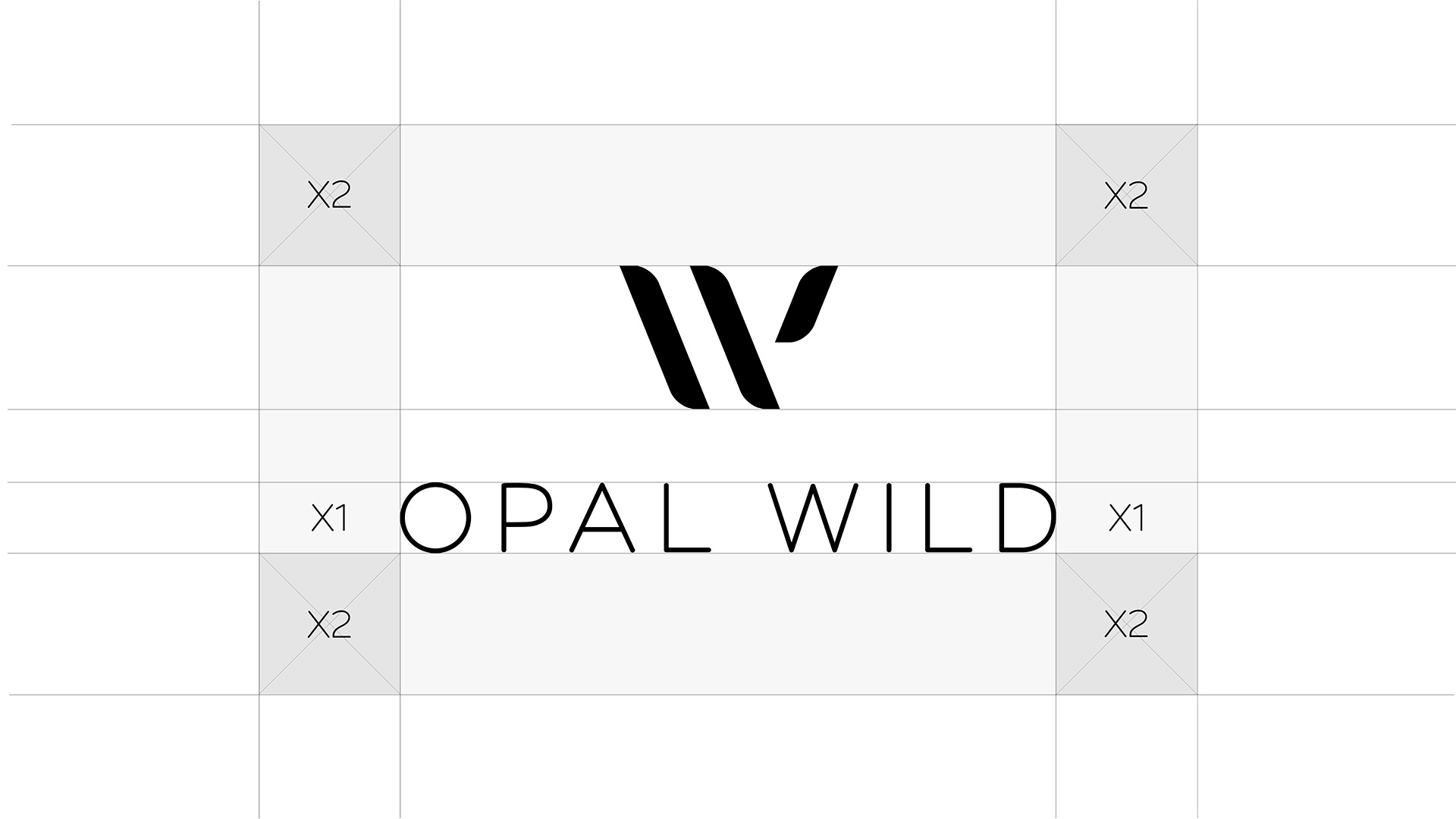
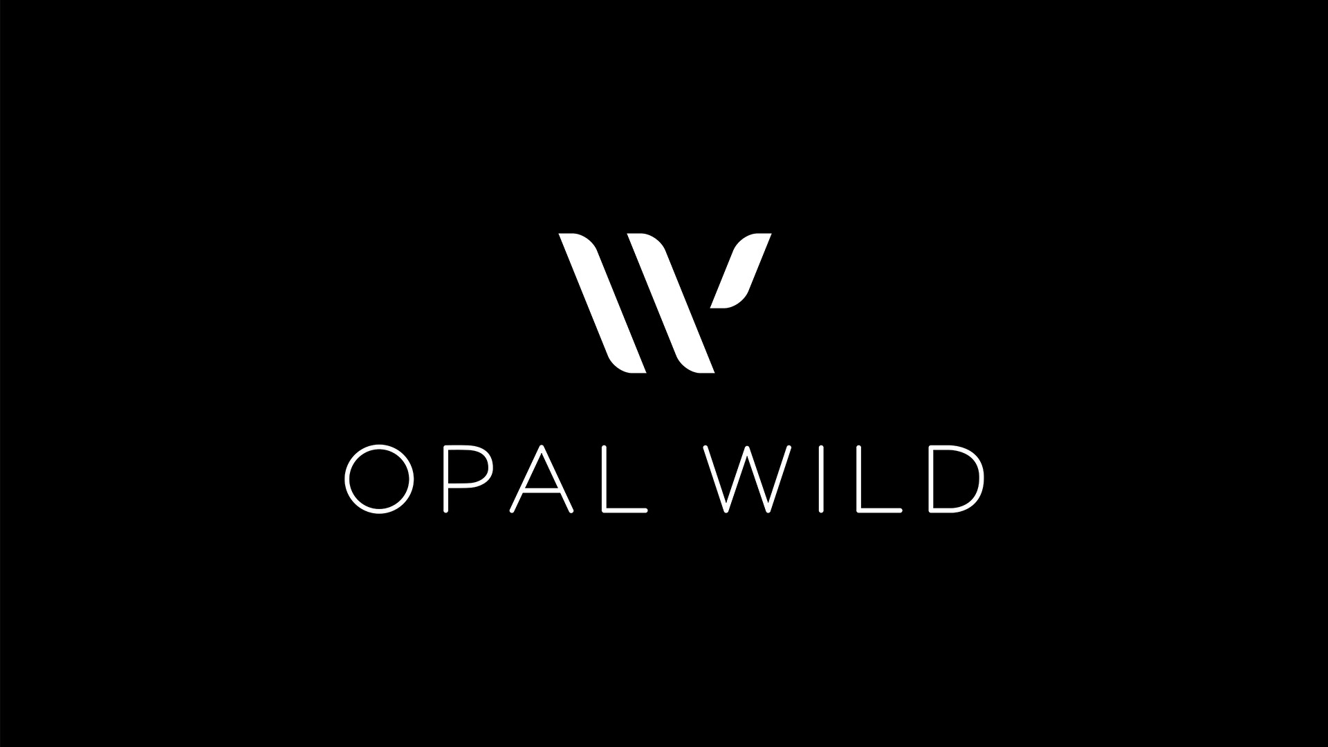
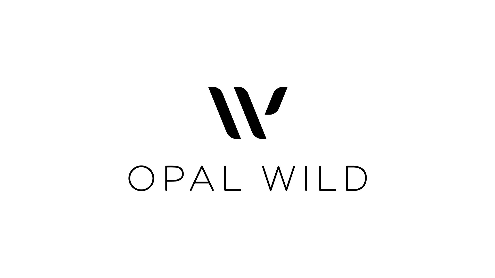
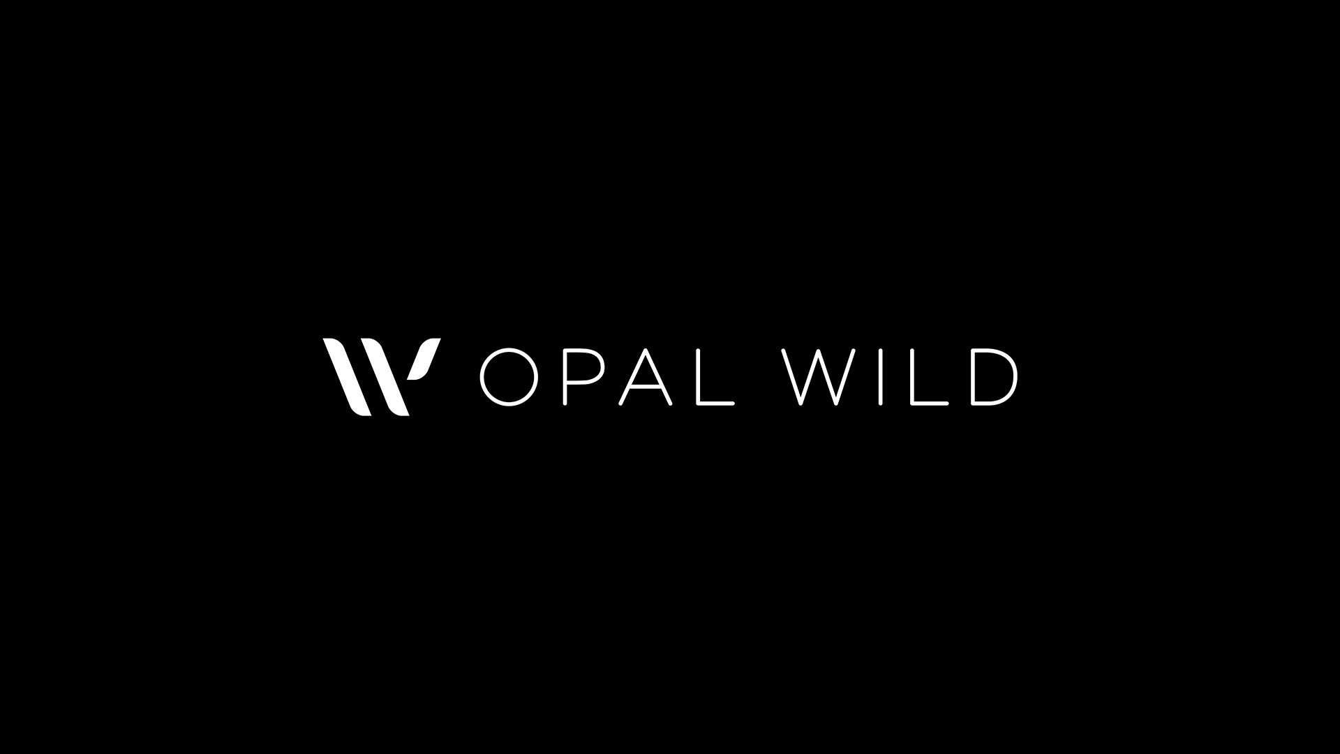
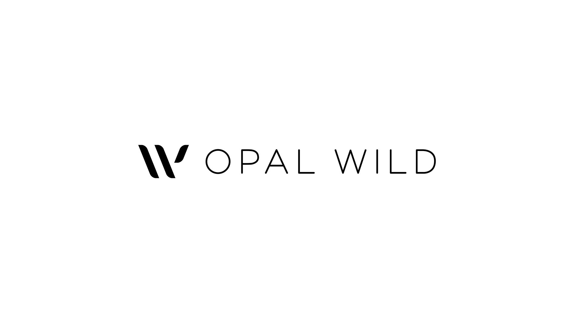
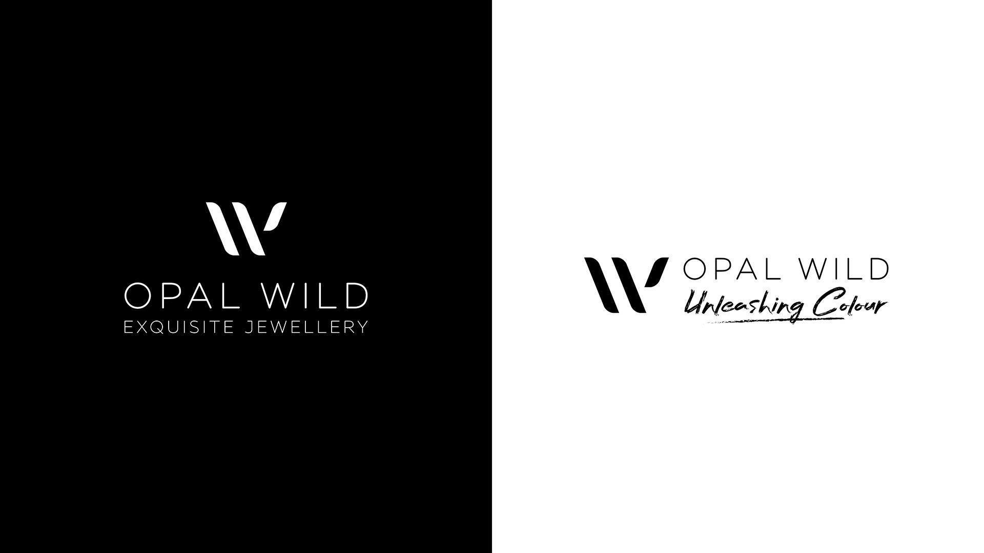
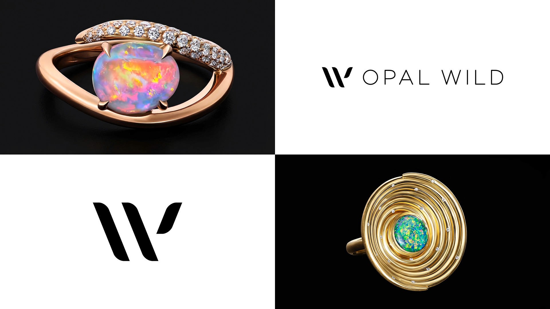
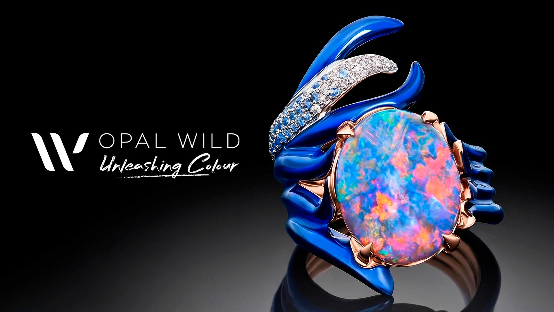
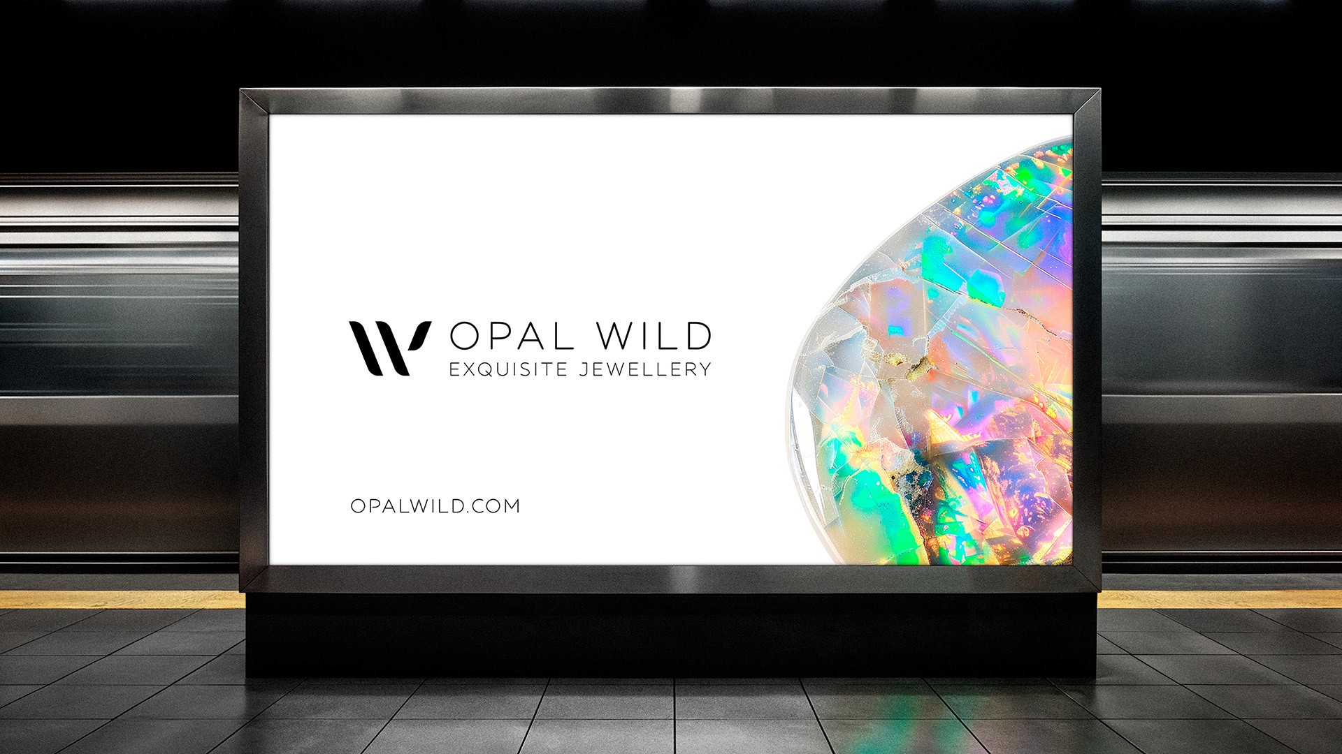
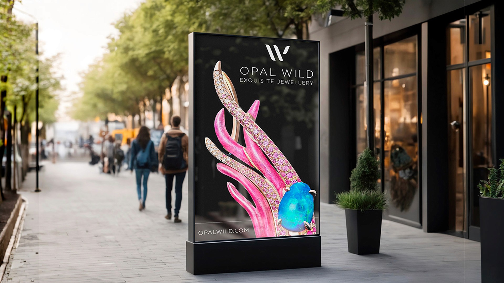
The creative direction centred on simple, yet understated contemporary elegance. A luxury jewellery brand earns its premium positioning through what it chooses not to do as much as what it does. The solution centred on a distinctive, dynamic W brandmark - bold enough to be immediately recognisable, refined enough to never overpower the product. A pared-back black-and-white palette was chosen deliberately, ensuring the vivid colours and textures of the jewellery always took centre stage.
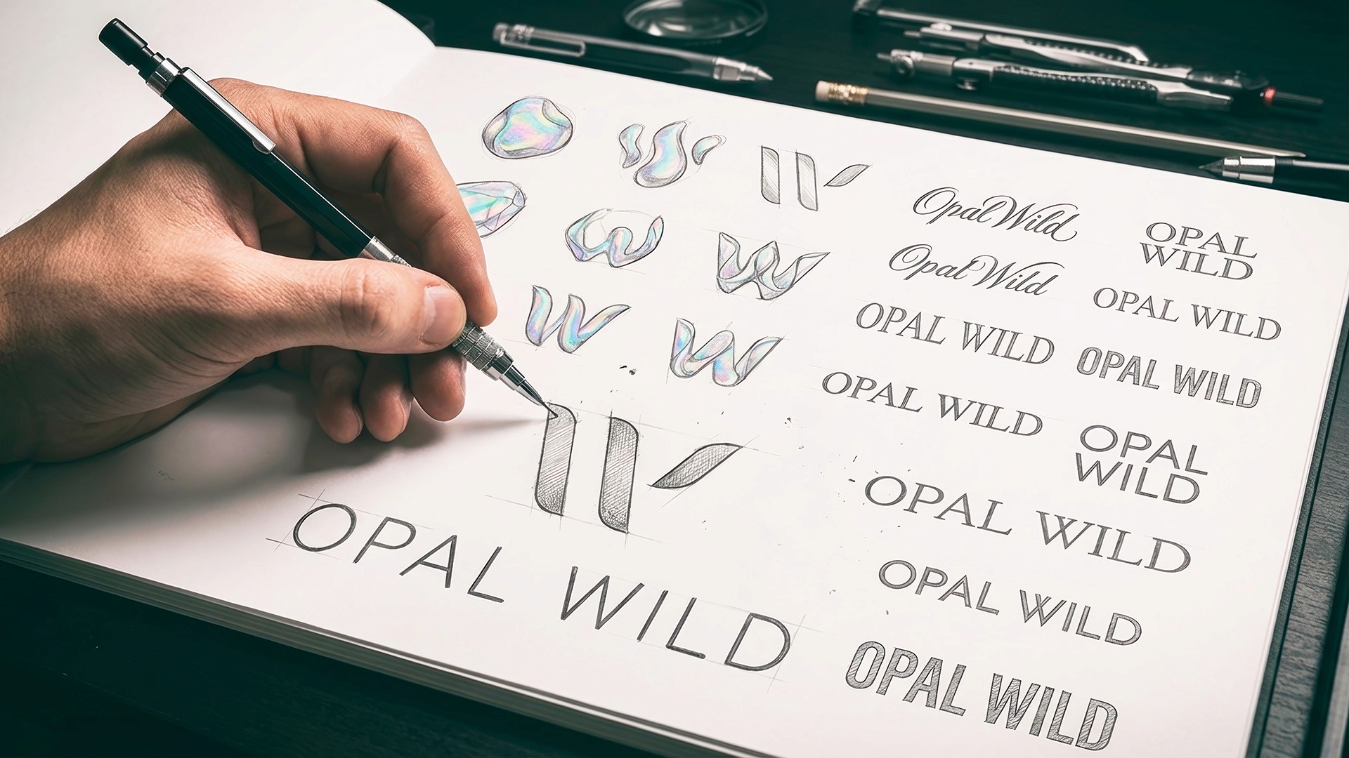
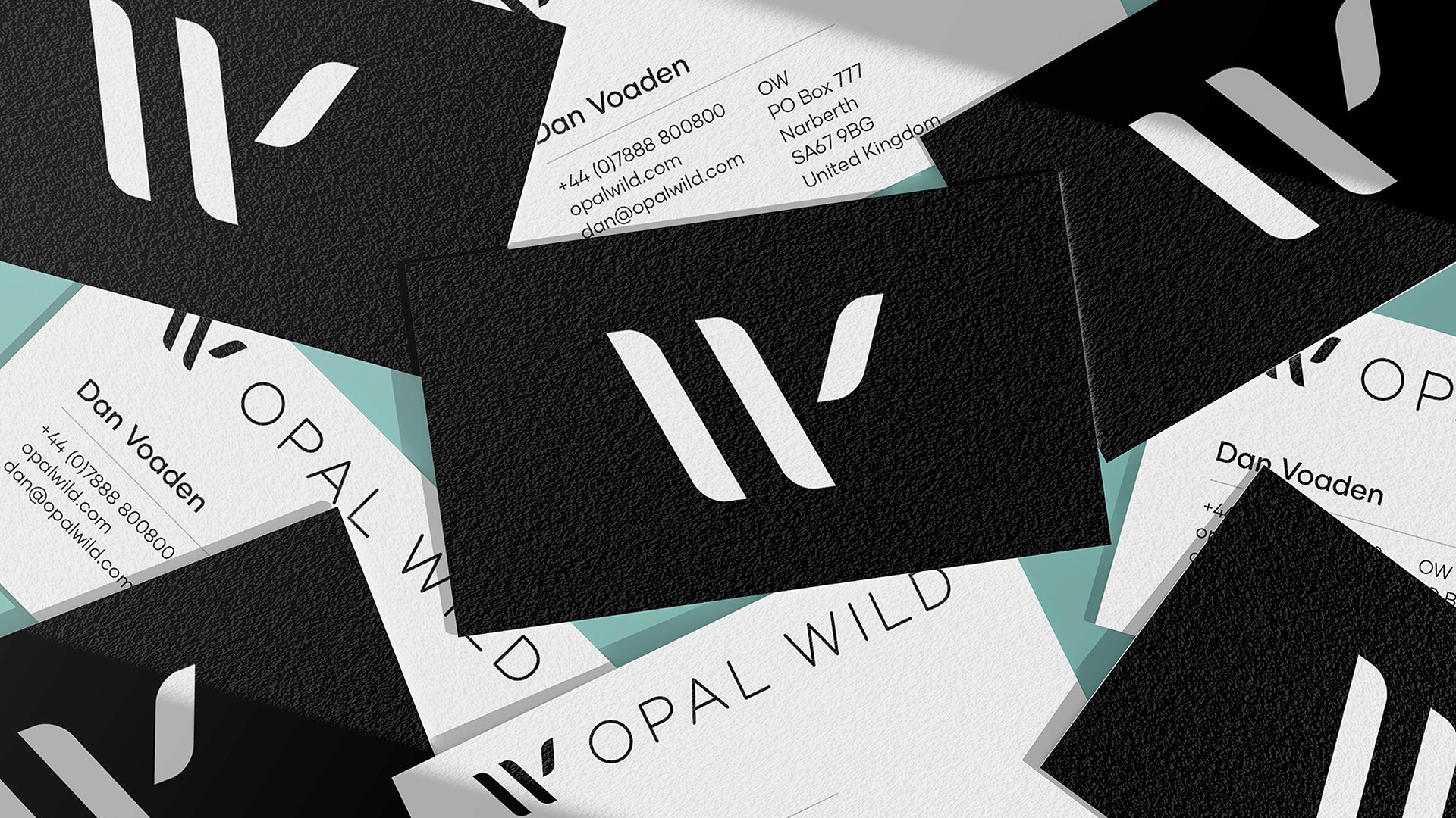
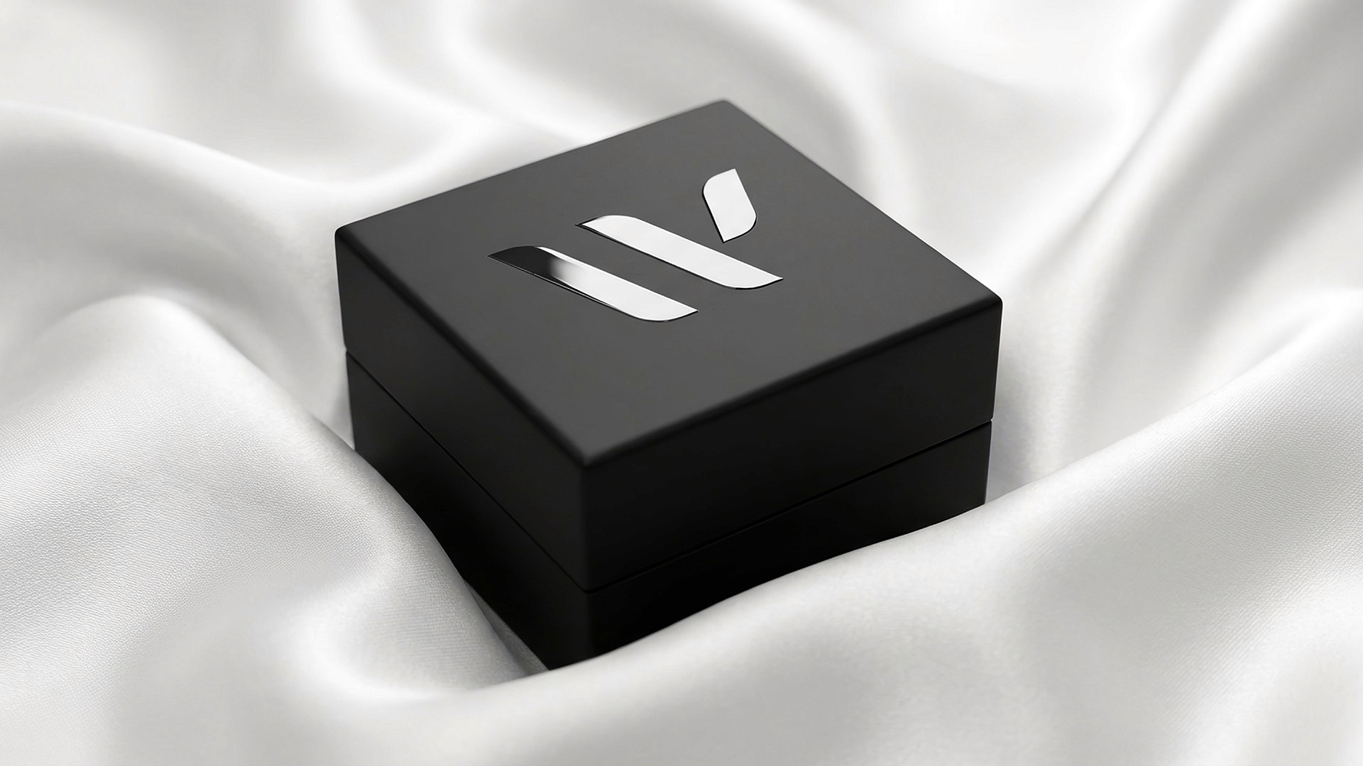
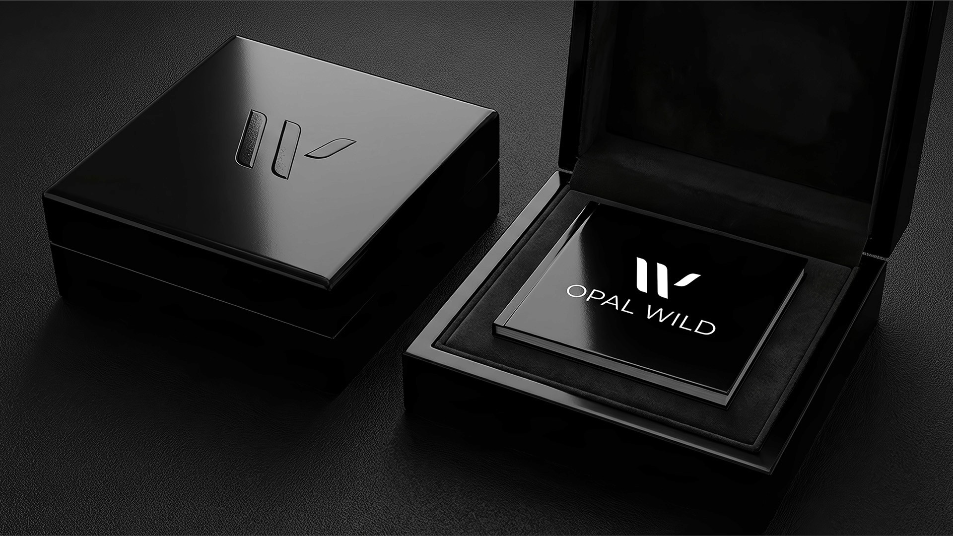
From this foundation, a comprehensive logo system was developed across multiple variants - primary and reversed lockups, horizontal and stacked formats, standalone icon marks, and a distinctive 'ligature' mark as an offshoot of the principal logo design - giving the brand complete flexibility across every application from swing tags to digital platforms.
Alongside the core identity, tagline typography was explored in two directions: a refined geometric treatment paired with the precision of the W mark, and a more expressive brush script carrying the line "Unleashing Colour" - a deliberate creative contrast that gives the brand an additional register to draw on for a range of campaign and lifestyle contexts.

The Outcome
The Opal Wild identity launched as a fully flexible brand system - impactful and designed to scale seamlessly across packaging, digital and future brand extensions while maintaining its luxury register throughout.
Client Feedback
"I knew what I was searching for but didn't understand what it looked like, and Huw helped to steer and land on a wonderful brand design that is clean, modern, high end and recognisable. In a crowded market, Huw is an easy choice."
Dan Voaden - Founder, Opal Wild